🚀 See the 2024 Ruby on Rails Community Survey results!

Entries tagged: user experience

Link  |  UX

What Might We Expect in 2017

4 Jan 2017

Article  |  UX

Which Festival Does UX Best?

1 Aug 2016

Which Festival Does UX Best?

When summertime comes, it’s a chance to get outside – barbecues, picnics, swimming, hiking, camping. And for many, it also means summer music festivals. Festivals of all genres and interests are organized every year around the world and are inseparable from the technology that makes it all happen. And it’s not just the technology that appears at the festival (like jumbo screens and holograms of dead artists). It’s also how we connect to the festival, before and during the event, that completes the experience. From schedules, to buying tickets, this is a comparison of the online experience of a few well-known (and some unknown) festivals.

Continue Reading

Article  |  UX

Portland Home Buying: A UX Perspective on Listings

24 Jun 2016

Portland Home Buying: A UX Perspective on Listings

For those who are in the process of buying a house, receiving your region’s multiple listing service (RMLS) via email is a common way of getting real time updates on houses that match your criteria. This post examines some of the issues I’ve experienced first hand using this information, and some solutions that might make the experience a little more enjoyable.

Continue Reading

Article  |  Strategy

User Research Is Unnecessary and Other Such Myths

13 Jul 2015

The better we understand users, the better products and services we can create. User research is a critical, yet often overlooked step in the development process. Read on for a look at a few commonly held misconceptions about user research and learn why it's more more accessible for your project than you may think.

Continue Reading

Article  |  Work

McMenamins Gets Mobile

14 Nov 2012

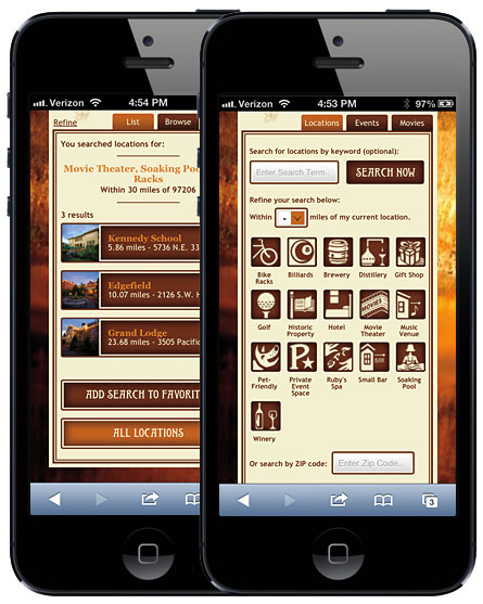
We started working with McMenamins earlier this year. McMenamins is a unique client in that most of its locations are of historic significance. They buy old, historic buildings and keep all of their unique history intact while converting parts of them to a theater or restaurant or bar or all three. They have more than 50 locations all over the Pacific Northwest. They needed a mobile site that would showcase what all their locations had to offer in terms of food, drink, movies, events, etc. For example, if you were looking for a location with a movie theater, a soaking pool and bike racks that is within 5 miles of your current location, you are in luck. Their new location search page will let you define your criteria to find that information. Whether or not you can actually sit in a soaking pool while watching a movie after locking up your bike isn’t guaranteed.

Fast forward to the present where we have launched McMenamins new mobile site that was designed by R/West, a local design shop, and implemented by your good friends at Planet Argon. It has been a fun and challenging journey for sure.

Continue Reading

Article  |  UX

7 Ways to Annoy Users on Your Web Forms

13 Nov 2012


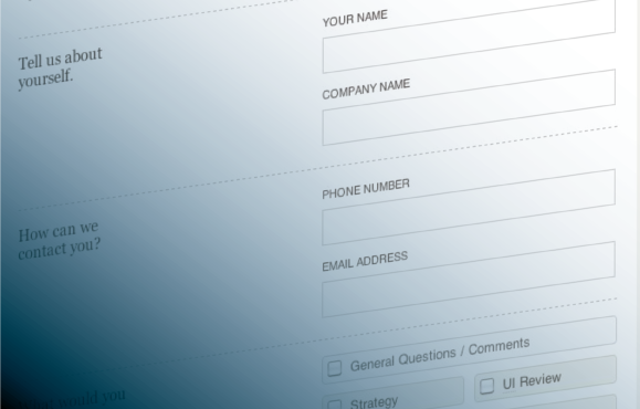
“What are the most annoying things you encounter when filling out a web form?” was a recent tweet posted by our Chief Evangelist and it got me thinking. Web forms are the one interaction you are most likely forced to deal with more regularly than you’d like; to sign up for that online service, join that social community, or just because completing the goal online is easier than offline. Usually it’s easier to buy that airline ticket online, instead of picking up the phone and calling that surely booking agent. Buying a ticket to that show should be more convenient than standing in a line at the box office. And yet, sometimes the online process can actually make it more complicated, frustrating, or maybe even impossible. Why is that? In many cases, it all comes down to frustrations with the web forms. Prompted by the tweet, we set out to uncover not only the most annoying things you encounter in web forms, but how they can be remedied.

Continue Reading

Have a project that needs help?