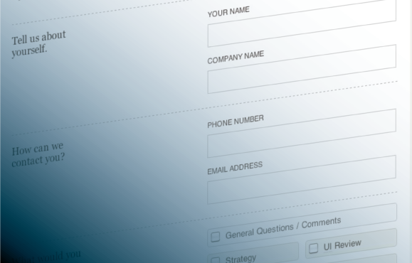
“What are the most annoying things you encounter when filling out a web form?” was a recent tweet posted by our Chief Evangelist and it got me thinking. Web forms are the one interaction you are most likely forced to deal with more regularly than you’d like; to sign up for that online service, join that social community, or just because completing the goal online is easier than offline. Usually it’s easier to buy that airline ticket online, instead of picking up the phone and calling that surely booking agent. Buying a ticket to that show should be more convenient than standing in a line at the box office. And yet, sometimes the online process can actually make it more complicated, frustrating, or maybe even impossible. Why is that? In many cases, it all comes down to frustrations with the web forms. Prompted by the tweet, we set out to uncover not only the most annoying things you encounter in web forms, but how they can be remedied.
Our history of forms

If you’re like me you’ve probably filled out lots of forms in your day. In school I remember filling out those standardized test forms, making sure my name fit perfectly into those small little boxes (but what happens when you have a name that’s too long! “OH NO” as you start squishing multiple letters into one box). In one of my first jobs I audited their paper forms (it was a city office – LOTS of forms), making sure there was enough space for things like telephone numbers. In another job I attempted to perfect an online form, with the goal of making it near impossible for a user to have any troubles (and making it easier for us to read the information). There’s a very good reason many have converted to web forms. It’s easier to type in. It’s easier to read. It’s easier to catch errors before submitting. It’s convenient. And yet, they are still fraught with issues. Here’s a few that you out there (and we in here) have found:
Issue #1: “For heaven’s sake, this is too bloody long!”
This is probably the bane of most people’s web form experiences. I completely understand that sometimes, depending on the service or information you are about to get, the company asking you the ba-jillion questions needs to obtain that information for a reason. But here’s some things to consider if you’re one of those companies:
Solution 1: Do you really need all of this?
Always make sure you really need all of that data. It may seem really obvious, but designers and developers can get in a routine when it comes to creating forms. You just start thinking of all the things you could need, without thinking of what you actually WOULD need to make sure the process works. Some information is for demographics. Some information is just plain optional. Pair down what is optional or try and find ways to consolidate fields (do you really need to separate out the first and last name?). Even just consolidating a few fields makes it seem a little easier to take.
Solution 2: Break it up.
It’s always easier to take bite size chunks instead of trying to get through one massive clump. Break your fields up by content and flow. Think about how your users will be inputting data (and from where) to make longer forms easier to manage and more time efficient. If you have to, maybe even consider breaking your form into pages (though not too many), and give your users enough feedback as to where they are in the process (and how much they’ll have to go through before they start) in the form of some progress bar/navigation breadcrumb.
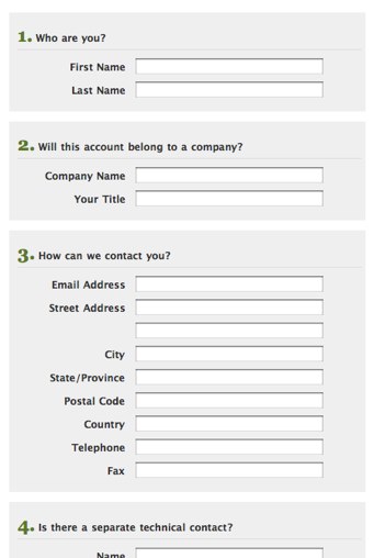 [An example of one of our forms, back in the day when we provided hosting services]
Solution 3: Remember what I already told you.
Whether it’s all on one page or broken into pages, don’t make users retype information they already inputted in.
- Remove fields that you’ve already asked for
- If there’s areas where the same information is needed, make your system work for them, not the other way around, by filling in the fields for them.
- Help users who have submission errors (maybe they missed a field somewhere) and remember the information they inputted, so they don’t have to retype it in again
- Provide ways to mark data as similar and consider if that should be done as default (like in the instance of shipping address and billing address, a default selection to make them the same (as seen below)).
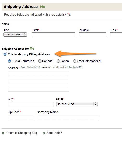 [like L.L. Bean, users don’t have to fill in two addresses if they are the same. Plus as a default, billing address is checked to be the same.]
Issue #2: “Where did you just take me?” (aka, incorrect tab order)

The use of tabbing or using navigational keys through fields makes life easy (or at least makes inputting that much faster and efficient). But nothing is more annoying than to finish a field, tab to what you think is the next one, only to find you’re in a completely different area of the page. What about those three fields that you seemed to have entirely skipped? It completely throws you off, and you spend the next few tabs wondering when you get back to that, instead of going along what should be your merry way of filling out the form.
Solution: Check your order.
This is easy. Just make sure your tab order is correct accordingly to the flow of the page – so that those who refuse to use their mouse (you know who you are) can actually use your form without fretting about the path their tabbing takes them. [need more information? Check out the documentation for ‘tabindex in HTML form elements provided by W3C]
Issue #3: “Why am I typing in this weird assortment of letters?”
 [You’re probably human. Can you read this?!]
Oh CAPTCHA. With your distorted letters that make no sense, you force me to look at each one and confirm yup I got that right – h..is that an o? t? e? Oh, forget it.
The intention of CAPTCHA is good. Confirm we are all human or pay the price with relentless spammers. But the distorted forms with meaningless letters that you can’t even read it because it’s so scrambled or so distorted, is not really helping us humans after all, is it? The point is to catch spamming computers by forcing them to do something, like spell out a list of letters displayed. But how effective can it be if you as a human can’t read it?
Solution: I’m a human. Please treat me like one.
There are better ways to use CAPTCHA. I highlighted some that were featured this summer (Are you human? Prove it by…), like making it a game that can be either visual and audio-based.
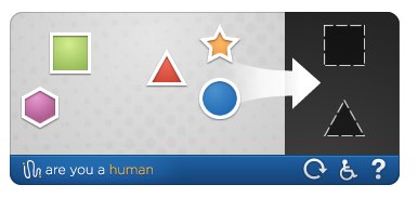 [are you human’s CAPTCHA game, bringing humanity back to spam catchers]
Or just use words that would be easy to recognize. CAPTCHA was meant to confirm human users by making them do a human thing. Like read letters and type them. They don’t have to be distorted or jumbled nonsense letter. You can be like IMDB and use names of well-known movies or actors, making typing in easier.
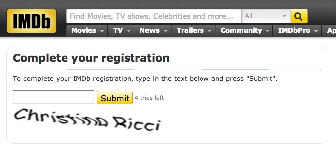 [my captcha for IMDB registration. I do like Christina Ricci movies.]
Issue #4: “There’s an error so I have to fill it in all over again?? Forget it!”
Uff da. Maybe it’s your fault (you put in the wrong credit card number), maybe it’s not your fault (stupid server!). It doesn’t really matter because the form you just spent 10 minutes filling out is completely gone. Some people may try again. Some may just leave entirely in frustration. Whatever the case may be, it’s an easy fix. Don’t frustrate your customers
Solution: Please save my information.
Referenced above, just remember what I told you, so I don’t have to retype it all in (at the very least the non-sensitive information).
Issue #5: “There’s an error, but I don’t know why?”
Take the above example (and frustration) and multiply it, because, now, not only have you lost all your data, but you don’t know why. Or maybe it kept the data (phew!) but it showing there’s an error, but it’s not showing you where. So you sleuth through the fields to figure out what you missed. Maybe, if you’re lucky, they gave you some sort of error prompt. But in written in some sort of internal code/language that you as user can’t understand. WHAT’S WRONG? WHERE?
Solution: If I made an error, just give me some feedback
A helpful or descriptive error alert (at the very least) would go great lengths to let me know what I did (or you did) wrong. Even more helpful would be to highlight the fields that are wrong, so it’s easy for me to find and correct.
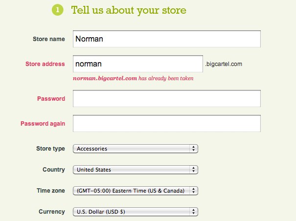 [miss some things on bigcartel.com and they’ll let you know. Both with an alert at top and highlighting fields with issues]
Issue #6: “Typing in my * password, hoping it’s right.”
 [the secret password]
This literally just happened to me as I had to reset a password for my health insurance. Passwords, I know, are a tricky thing. They are meant to be secure and safe. I understand that , similar to the pin number I type into the ATM, you don’t want that person behind you sneaking a peak and learning what your password is as you type it in. But in my personal opinion, nothing is more aggravating if you are trying to type in something you can’t see. Practically daily my fingers get the best of me and I type in my password wrong. Where I slipped up? I don’t know, but I try again. Double the frustration when you do it again. Now comes the doubt of whether you even have the right password (wait, is it bananaslug13* or b@nanaslug13?). Another wrong try and you may be locked out (and then you might have to actually call someone to fix it)!
It’s the same frustration when you’re asked to write in and then confirm a password you just typed. Sure, you might remember it (you should, you just typed it in 2 second ago). But you don’t know that you typed it right the first place, and now you’re trying to match it with an also completely hidden password. Sometimes you don’t even know until you hit submit that they were wrong (and lets hope you’re not faced with issue #4 where you lost all of your information)
The whole thing just forces you to pick and poke at the keyboard like you did when you were a kid. p-a-s-s-w-o-r-d.
Solution: Welllllllll…it all depends.
When it comes to passwords, it depends on who you talk to. There’s been a pretty healthy debate on it actually. Some may say that security is the bigger issue and encrypting passwords shouldn’t be that big of an issue. Some may argue about who could possibly be looking over your shoulder to sneak a peek – that frustration alone hurts businesses more. A Smashing Magazine editor recently wrote an article detailing a few ideas he had for making passwords easier in a form in Better Password Masking For Sign-Up Forms.
While these are his opinions there are some good ideas in the article (and even in the comments) like giving the user the option to show the passwords or showing the last character typed (though I know some look at the keyboard when they type – so this might not be entirely helpful).
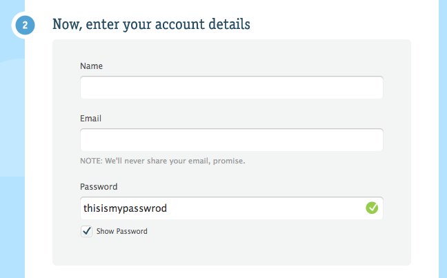 [could the experience be better if you could select to see your password, like Carbon Made does?]
But just a quick view on the comments could tell you that everyone has a different view on this. Last week we posted a link on this very issue based off of Luke Wroblewski’s blog article Mobile Design Details: Hide/Show Passwords about the necessity of hiding passwords on mobile devices (which mobile web forms is an entirely different topic and one better suited for it’s own mobile form annoyances blog post). In any event, it might be best to tailor a solution to your own needs and users.
Issue #7: “Why can’t I choose my own password?”
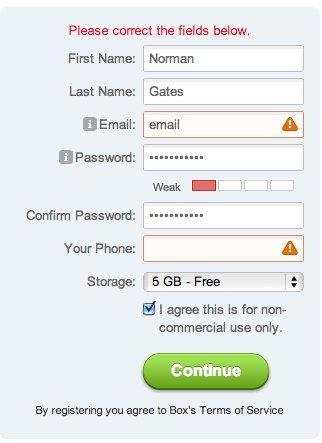 [who cares if my password’s weak!]
Along with the difficulty of remembering your password, is the frustrating task of picking a password that some system finds suitable. How many times has this happened to you? You have to change your password (probably because you aren’t using a password manager and forgot the original password) and on the fly you have to think of something that you’ll remember. Along with the other obstacles you have to endure (include a number, don’t include a number, include more than 8 characters, don’t include any non-alphabetic characters), you promptly are notified when your password is too “weak”.
Solution: Let me deal with the issues of a weak password.
Trying to find the sweet spot for what some app validator thinks is a “strong” password can be a frustrating user experience. I think most users know the importance of having stronger passwords. If the password I choose is still “weak”, let me deal with the repercussions, don’t force me to keep trying, only to create some cryptic password that I’ll probably forget the next time anyway.
At the end of the day…
We will probably always have annoyances in our web lives from time to time. But when it comes to designing for the web, the best advice I’ve ever been given is…ALWAYS TEST YOUR IDEAS. If you’re designing a web form, do your due diligence and test it on users, in all environments (desktop, mobile). You’ll get the most important and helpful information based on how your users interact with your design than by dreaming up the best form in the world in your head. But at the very least, do try and take some of the above grievances to heart. It might help you in the beginning.
What are you grievances?
Since we are getting it all out on the table, what are your annoyances with web forms? Listed above are just a few, so we know there’s many more out there. Tell us below – we’d love to hear your thoughts.
Helpful Links
In writing this blog, I didn’t want to make it entirely from my experience. So I did some researching and found these helpful links on the topic.
On Passwords:
Better Password Masking for Sign-Up Forms
Stop Password Masking
On usability:
An Extensive Guide to Web Form Usability
10 Things Every Designer Needs to Know about Forms
Web Form Design: Filling in the Blanks
Some research on patterns:
Web Form Design Patterns: Sign-up forms
Web Form Design Patterns: Sign-up forms (part 2