Recently, the web community has been sharing a link that argues that carousels don’t work.
A half-baked defense of carousels
11 Jul 2013
11 Jul 2013
Recently, the web community has been sharing a link that argues that carousels don’t work.
9 Jul 2013
Earlier today, our good friends from Portland Homeless Family Solutions stopped by to meet our team.
3 Jul 2013
If you attempt to make sense of Engelbart’s design by drawing correspondences to our present-day systems, you will miss the point, because our present-day systems do not embody Engelbart’s intent. Engelbart hated our present-day systems.
Doug, we'll miss you. Thank you for opening up our eyes.
2 Jul 2013
Back at the end of May, I went to the 2013 Webvisions Conference. I had decided that I would use the conference as an opportunity to take some “Sketchnotes” and post them to the blog as my contribution of what I learned at WVs this year. My post last month was on “The Art of Explanation by Lee LeFever”. This month, I have 2 new sketch notes that I have uploaded. .
2 Jul 2013
We look back at all of our design and development clients since 2006 and breakdown, by month and season, when they made a decision to hire us.
28 Jun 2013
In my role as a Business Developer at Planet Argon, it’s important to keep connected to Portland’s creative and business community. One of the ways I attempt to gather local intelligence and randomly bump into interesting strangers from other companies, is to regularly attend several of the awesome networking type events around town. There are many to choose from, but this post will focus specifically on CreativeMornings.
24 Jun 2013
Kris Gale of Yammer talks about the costs of introducing complexity into your application.
While I agree with many points, i do worry that sometimes there is too much of a disconnect between Engineers and the Product Owners. If you’re in the position of asking someone to build something… are you explaining why it needs to be built?
If you’re the person being asked to build something… are you asking why?
20 Jun 2013

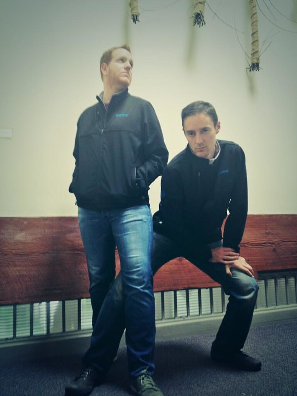
Our friends over at Blue Box (awesome Ruby on Rails hosting) sent a few of us some nice jackets. We’re hoping they’ll include us in their 2013 Fall Fashion catalog.
18 Jun 2013
When I first came on staff as a User Experience Designer at Planet Argon, one of my very first projects was to take our responsive site, Brainstormr and bring it into the mobile world by building an iPhone application for it. My experience designing Brainstormr was the first time I had gotten an opportunity to do a Mobile Application design and I jumped at the opportunity. There was a lot of research and learning involved, but it was totally worth it, and now i am proud to say my first application design came out a success. Here are a few things I learned along the way.
18 Jun 2013
So often people are working hard at the wrong thing. Working on the right thing is probably more important than working hard.
Always ask yourself, "how does this benefit our mission?"
Have a project that needs help?