
It’s a fact that Portland is a hot market in terms of home buying. I can attest. I’ve witnessed this circus firsthand, and it’s madness. I should have expected it. Co-workers and friends in the past year have spent months searching for their homes – leaving at a moment’s notice to check out a home for fear it would be snapped up in hours.
Luckily, there are tools in the real estate market to make it easier to look at houses on your own from anywhere, anytime, immediately. Redfin, though it offers more services I wouldn’t use (like using their real estate agents), is my jam to make searching easier, especially while we are on the go (with its location-based search). Zillow may still be the leader in the field, but its clunky interface (especially on mobile) turned me off as a user.
But there’s also getting information directly from your region’s multiple listing service (or RMLS). RMLS feeds into the Redfins, Zillows and all the others out there. Real estate agents actually use the RMLS directly and can set you up with a direct feed based on your search criteria. So as matching listings are entered, you get an immediate email notification with the listing.
Sure, you can set up notifications from Redfin and Zillow too, however, they also send you a lot of information that you don’t need and a lot of noise (and yes, you can turn this off as well, but…what if you miss something?). All this is to say – the RMLS email we get is what we asked for, nothing more… nothing less. And truth be told, there’s something about getting it from “the source” that feels more trusted (maybe it’s from perceptions like these).
But I’m just one user. There’s also our real estate agent’s version that includes private info that they need and use. In fact, our real estate agent often prints out the listing each time we go look at the house. And I realize there are probably more users that might find the RMLS more helpful than the more private homeowner service – commercial/land seekers, etc. I did not interview any of them for the purposes of this blog. This is strictly from a personal family-home buying perspective.
Using the RMLS
So the RMLS is the trusted, reliable, accurate, timely source. But here’s the deal.
The RMLS email/listings we get (and that our real estate agent uses) looks like this!
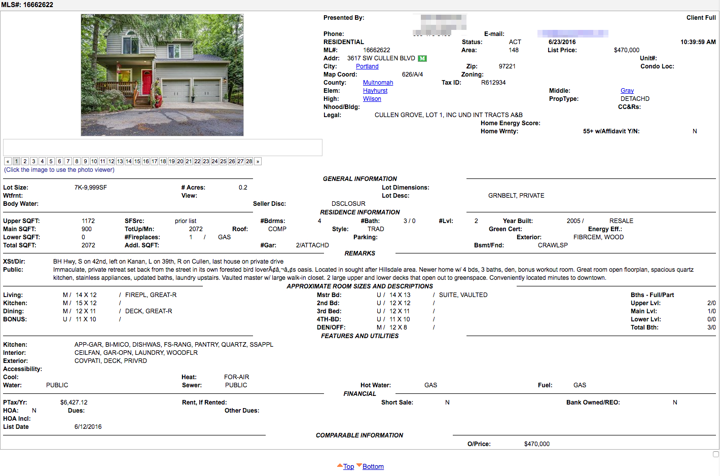
And if you’re lucky, your matched listing can include multiple houses. Ours right now includes 61 – in what seems no particular order (e.g., not by list date, MLS number, price).
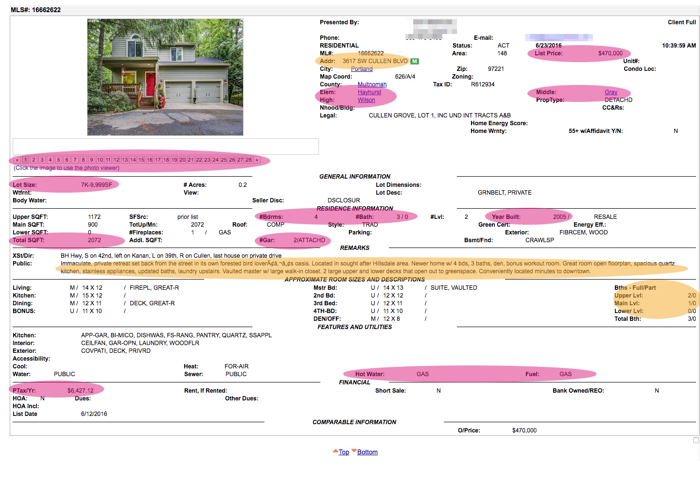
But here’s the crazy part. Here are the details that I believe are to be important to a buyer (as these are the ones important to me)
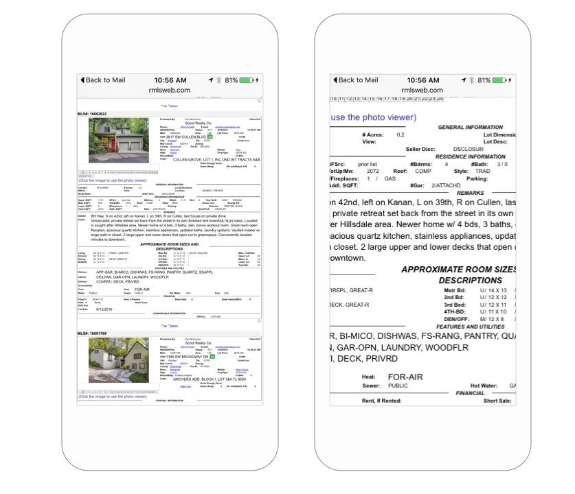
Even better, is what this looks like on the device I’m more likely to see it on – my phone. (These emails are coming in real-time, so most of the time, this is the first thing I see in the morning, and the last thing at night. It’s a great test of my ability to tap small buttons and pinch and zoom).
So yes, Redfin is so much nicer than this – and often times, I’ll look at my RMLS email, and then I’ll open up Redfin and try and find the listing so I can view it on a nicer platform. But does it have to be like this?
Our real estate agent laughed at me when I commented on how horrendous this was, then assured me after years, she now knows where to look. And it goes like this:
Roughly in order: address, neighborhood, schools (to double check my mental mapping), lot size, square footage, year built (to give me a sense of layout), beds & bath count, room layout (via U, M, L designations), terms (not pictured), property taxes, and listing agent (not pictured). Then back up to flip quickly through the photos. Takes 10-30 seconds, depending on how much detail I look at.
So taking my listing, that looks like:
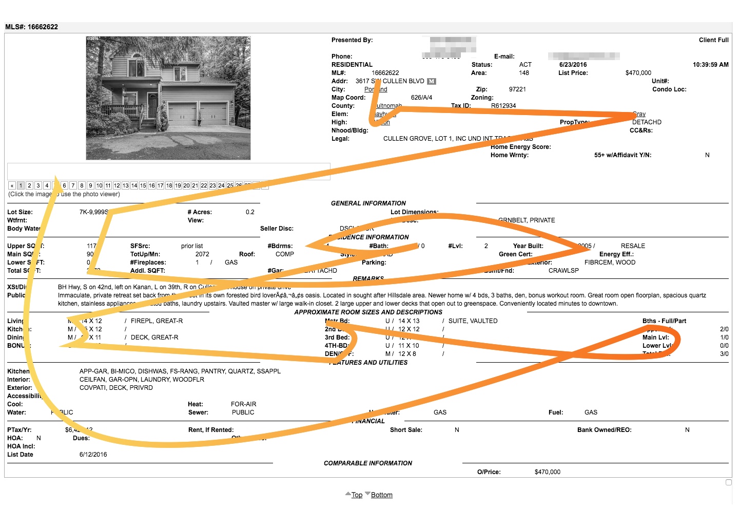
While 10-30 seconds doesn’t seem like much (she’s a pro at this, so it might take longer for others), this page requires more thinking and memorization than one really needs.
Think of how much easier if these reports were created with the users in mind. And while there are other tools, these reports are still very useful to me (and my real estate agent). Not to mention their online use, this serves as a nice compact listing – making printing a little easier. Redfin will print a listing too…on 7 pages. So I think the changes I’m about to suggest are still valuable.
Some Design Changes to Consider
1. Understand User Needs to Provide Relevancy
There is information that is pretty important to me and in one quick look can tell me whether or not I’d be interested in a property. There’s also A LOT of information that I don’t need to know right away (but probably will at some point). By surveying and asking users what information they need, you can begin to understand how to organize information, and do things like:
- Be able to highlight most important information at the top, maybe as the “basic”.
- Enlarge the copy slightly to give priority information more visual prominence.
- Create custom reports based on user preferences/types, to reveal specific information in priority order. For example, as your real estate agent adds in the filters (e.g, zip code, price) perhaps other areas of relevancy or even user type could be suggested, like schools or square footage, or other areas that other buyers are looking for (ADUs) can be marked, and appear in this “preferable view”.
2. Understand how people read and…make it readable
This is actually the biggest offender, because the content is sorta organized on the report. However, the labels and content spread across the page, so what you’re trying to read is a cobbled mess. This along with the fact that some of the important info is mixed in with the not-as-important, it leaves users are scanning all over the page with no grid to help their eyes.
Putting information within a grid can still allow for flexible data (e.g. maybe there’s more information on zoning than on other properties). But the key here is also to keep it scannable and readable. Here are some ideas:
- Keep the grid consistent and keep spacing consistent. This means titles and labels and info are all on the same vertical line
- Understand eye flow. Following research done on the subject, users normally read across and down in an F shape. While it doesn’t mean all of the data has to be in that shape, it can give us clues as to how to align information (instead of the current layout which has more of a zig-zag shape (if any) – which can lead to overlooking/failure to find or just fatigue).
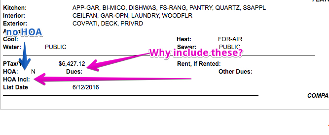
- Remove extraneous info to remove noise. There’s a lot of content that still shows when nothing is inputted, leaving empty labels. Here’s a great example. The listing below is marked no HOA, yet the labels for HOA dues and what the HOA Includes still show. Why not hide those which would remove extra information your eye might catch?
3. Create Visual Hierarchy
Using the organization work you’ve done above and knowing the grid you are working with, now there’s some flexibility to add some subtle styling to make it easier to scan.
- Using bolding for labels and important info.
- Consider making some things larger.
- Leave a little breathing room with whitespace.
- Highlight summary in its own container.
What does that look like?
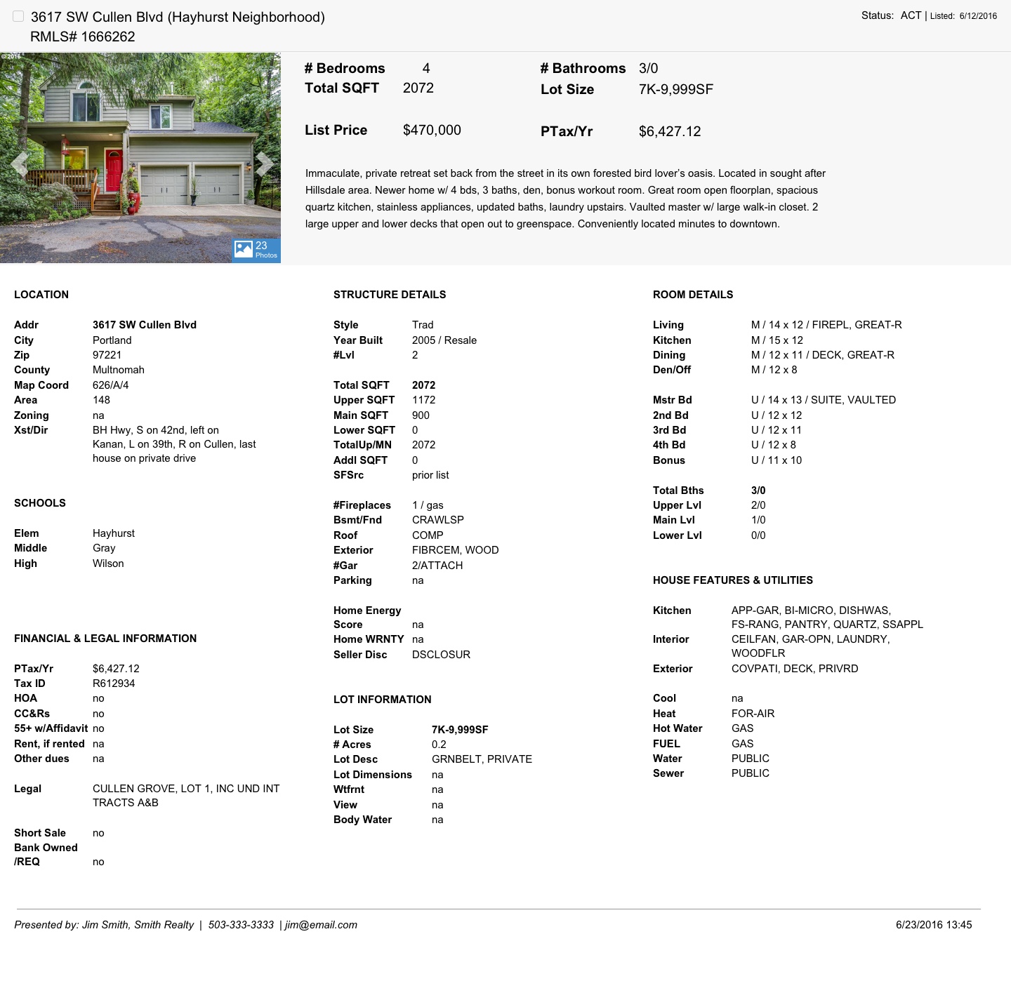
Here’s a quick shot at some ideas, taking the current information from a listing I received.
Highlights of my redesign
- Address and MLS number are the main identifiers at the top with status and list date (so as not to be confused with when the report was run which is down at the bottom.)
- What’s with the checkbox? This is mainly for multiple listings to be able to select properties for a smaller list – its current location was ill-placed way down at the bottom of each listing
- Add a summary area with a photo, basic info and description, to aid in quick glance.
- I removed the incredibly small number navigation for the photos, and instead hinted at the number of photos available (to be viewed on a different screen) and navigation to scroll through the photos.
- The basic info is repeated in some places, but can be an “at a glance” look at important details
- The description I’ve kept in the summary, more for its ability to span across the grid, but also knowing this might be something glossed over (which is ok, it’s usually marketing lingo anyway)
- Three-column grid with information on location, structure, and then specifics on rooms. Note: I put fields in this order since information is broad, to property to room. However, it may be that the order of these grids change – this would be something I’d love to test.
- This grid keeps information easy to scan, spot, and read
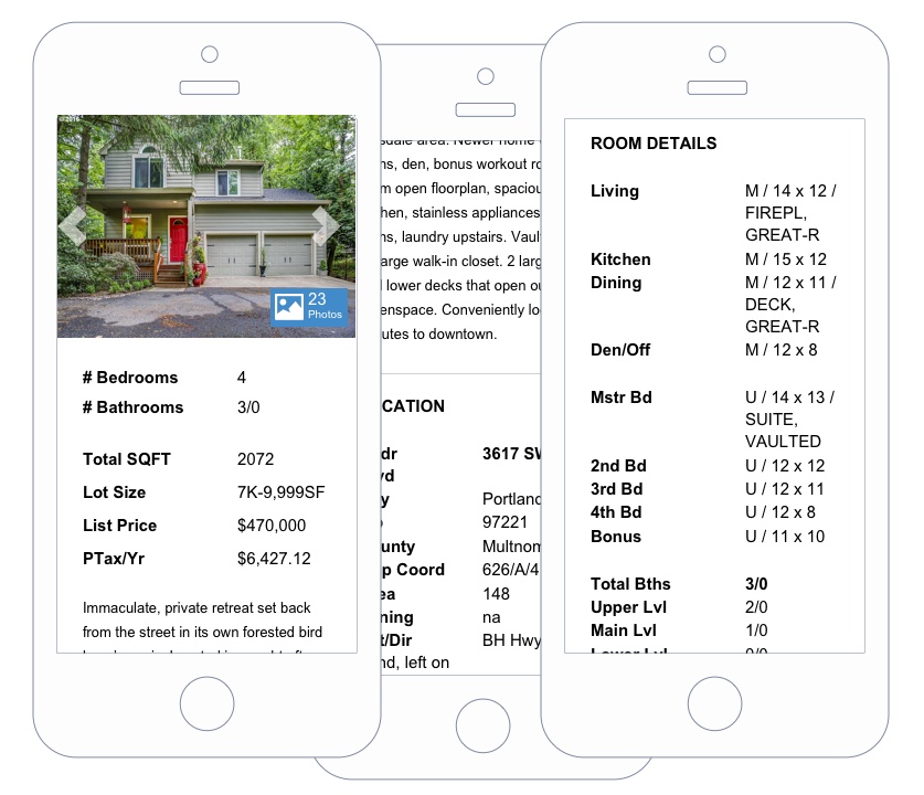
- The grid also allows for this page to be responsive, turning this into a one-column format
Conclusion
My experiment here shows that if you can take the time to understand the content you are trying to provide, talk to the people who need and use that content (and learn why and how), and the ways and devices/mediums those people are using to get that content (print, mobile, desktop) you can drastically change their experience, make them more efficient, and hopefully simplify their lives that much more.
Disclaimer: This was just an experiment in redesigning an online resource I have been using regularly. This is not based on anything other than my own experience. If this were a client job, I’d want to talk to multiple users and determine their needs to determine priority of content and then test out my ideas.