
Healthcare is something that impacts the lives of everyone around us. You’ve likely interacted with a healthcare website in the last year in some form, whether it’s refilling a prescription, finding out more regarding your insurance coverage, or seeking treatment for an ailment. As long as humans are around, healthcare (in some state or another) will be around, too.
But if healthcare impacts such a wide range of people, why does the experience of dealing with your health online usually totally suck? Often, sites aren’t mobile-friendly, it’s difficult to find the information you need, or you’re directed to an in-person solution or a phone number. But your user's experience doesn’t have to be miserable. Here’s a round-up of some of the best healthcare website designs around.
MD Anderson
The homepage of MD Anderson is engaging while serving as an effective portal to deeper sections of the website. Overall, it’s both friendly and professional – in many ways, it positions MD Anderson as a trusted, reliable source of information and help.
Since it doesn’t have a singular end goal, such as making a doctor’s appointment, this site needs to be succinct and easy to navigate through a wealth of information without being overwhelming. The top navigation on this medical-focused website is geared toward the user. Whether you’re a doctor, donor, or patient, you know exactly where to go. A secondary navigation further separates users by need.

Photos of care providers, survivors, and volunteers in a moving tiled layout adds a nice visual touch to this site’s homepage.
One Medical
One Medical’s group of San Francisco Bay area doctors have an online experience that places them far above many other healthcare providers. In a tech-savvy region, One Medical built a site that resonates with their audience. I’d say it’s pretty uncommon to see your medical provider list the magazines they’ve been featured in, but for this company, it works. Paired with testimonials in the form of Tweets, this medical group caters to their audience brilliantly.

Beyond the home page, the locations page is likely one of their most popular pages. Here, visitors can decide if One Medical’s office locations work for them. Photos on this page showcase their modern, bright offices around a familiar Google map.
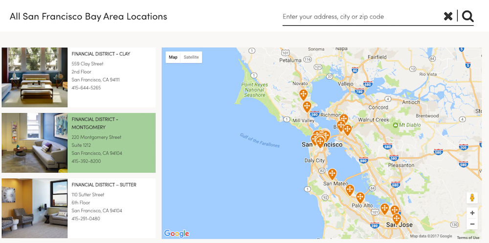
Who wouldn’t want to visit a doctor’s office that’s decorated better than their house?
ZoomCare
In our discussions about healthcare web design, the Zoomcare website comes up again and again. It’s a wonderful example of what similar healthcare websites should aim for.
The simplicity of their business model allows them to capitalize on a straightforward design. There’s a clear, concise call-to-action to select the type of care you need. You don’t have to dig to figure out what to do next.

From the home page, the site automatically filters which doctors fit your needs and are available, how far away they are, and what times you can choose. Having a photo of each doctor is a nice touch, and provides a more personal connection for the patient.

Plus, the site is entirely responsive. It’s easy to navigate on any device, though there is a healthcare app for iOS available as well.
ZocDoc
Zocdoc is similar, in a way, to the focus of Zoomcare. The difference is that they have a core focus – finding a doctor and making that super easy for you. The color palette of their website is bright and soothing at the same time. It’s cheerful – just what you need when you’re under the weather.

The feedback, icons, and interactive visuals on the website match the feel of their colors. It’s as delightful as a visit to the doctor can be.
![]()
Beyond its lively appearance, the Zocdoc website packs a punch in functionality as well. Once you select your ailment, location, and insurance, you’re presented with a list of practitioners. The filtering there is helpful, and likely based on user research to see what people look for. You can filter by appointment time (later in the evening, for example), gender, and day of appointment with a quick toggle. There’s also a built-in map.

Memorial Sloan Kettering
Memorial Sloan Kettering (along with MD Anderson, above) differ from the others in this list based upon the amount of information they have to fit into their site. They’re providing resources, research, and help for caregivers, patients, and volunteers alike.

Visually, they lean heavily on photographs of real people, rather than icons. This connects the user to what they’re reading about more personally. Combined with succinct copy, like “More Science. Less Fear” and “Life doesn’t stop when cancer strikes,” the end result is powerful.
While they provide additional services beyond scheduling visits, they do position their appointment request above the fold. This prevents excess scrolling and clicks for visitors who need help.
Collective Health
In the healthcare insurance and benefits space, a user’s experience with the website often seems like a total afterthought. Collective Health totally changes the game with a simple, uncluttered homepage with a clear path. By limiting the amount of copy on the homepage, the user won’t get bogged down with extra information. They’ll be able to quickly navigate to what they need.

They position themselves as an alternative to traditional health care plans for businesses, and they have the experience to match. Since Collective Health is fairly new, they don’t have to pack as much information into their site as some of the others on this list. As they evolve and grow, it will be interesting to see how they adapt their site for a bigger audience.
Nuclearmed
When working on a previous healthcare website redesign for Seattle Cancer Care Alliance, our design team came across the Nuclearmed website. While it’s not quite as comprehensive as other websites in the healthcare industry, there are aspects of it that marry what we love about a simplistic design. It goes far beyond the static brochure look and feel of older healthcare websites.
Specifically, the Diagnostic Toolkit is interactive and unique. You can visually select a place in the body or a symptom you’d like to focus on.

The site is bright without feeling noisy, drawing engagement without letting design become distracting.
We did notice an unfortunately user experience lapse during the appointment-making process. This passes the user to a 3rd party tool, Booknow, that doesn’t maintain the simple experience. It’s a bit of a clunky handoff, but a good reminder that you don’t have to build every bit of your website from scratch. If there are 3rd party tools that make your web development simpler, just look for styling options to integrate closely with your site.
If you’re struggling with a redesign or user experience audit, the examples above should give you the medical design inspiration you need to push ahead. And if you're looking for an outsider's perspective to revamp your website and grow your business, click below to get in touch. We know healthcare, and we'd love to talk with you about your design challenges and goals.
.png)