 The
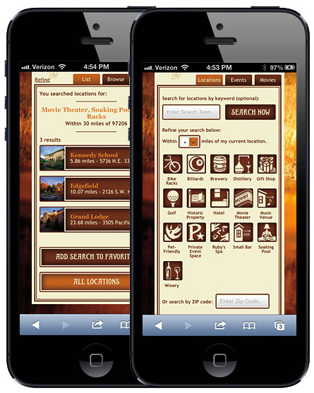
The We started working with McMenamins earlier this year. McMenamins is a unique client in that most of its locations are of historic significance. They buy old, historic buildings and keep all of their unique history intact while converting parts of them to a theater or restaurant or bar or all three. They have more than 50 locations all over the Pacific Northwest. They needed a mobile site that would showcase what all their locations had to offer in terms of food, drink, movies, events, etc. For example, if you were looking for a location with a movie theater, a soaking pool and bike racks that is within 5 miles of your current location, you are in luck. Their new location search page will let you define your criteria to find that information. Whether or not you can actually sit in a soaking pool while watching a movie after locking up your bike isn’t guaranteed.
Fast forward to the present where we have launched McMenamins new mobile site that was designed by R/West, a local design shop, and implemented by your good friends at Planet Argon. It has been a fun and challenging journey for sure.
Out with the old. In with the new.
The previous mobile site for McMenamins was pretty basic. You could see a list of all locations and you could get a list of current movies and events. There was some basic location based search available based on your zip code, but that was about as far as it went.
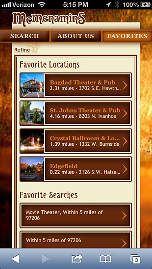
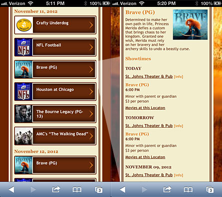
The new site aims higher and provides much more relevant information. One of the new features on the site is the ability to favorite locations and searches. You can run searches just on your favorite locations and you can save searches that you run repeatedly (example: movies playing within 5 miles of your zip code).
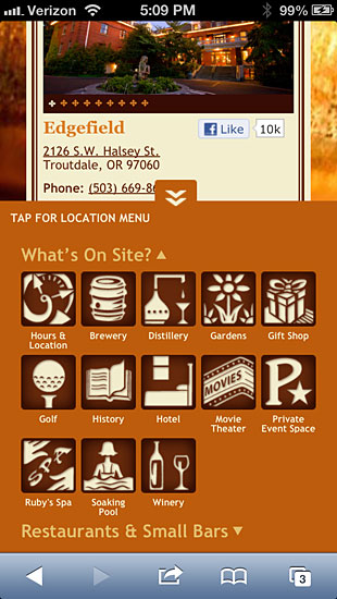
Searching also got a lot smarter. For example, you can now search for locations by keyword, distance, and amenity. Now it is easy to find a location with a music venue and a brewery that is close to your zip code. Once you are on a location page, there is a unique feature we are calling the ‘locker’. This is a drawer at the bottom of the screen that contains links for the specific location your are viewing. If that location is part of a larger location, affectionately called a ‘joint’, you get a link to that location’s page.
The smarter search also lends itself to events and movies where you can search by keyword, type and distance.
All of this plus a fancy redesign equals a much more usable and friendly mobile experience for McMenamins’ customers. Here is how it went down.
Wiring up the Wireframes
When we were brought into the project, McMenamins and R/West were already hard at work handling the UX design and wireframes for the new mobile site. It was at this point that we got the lay of the land of how the mobile site would work and what our responsibilities would be. It was helpful to be brought into the process at this time as we were able to voice any concerns about the proposed functionality and ask questions about how the site would work.
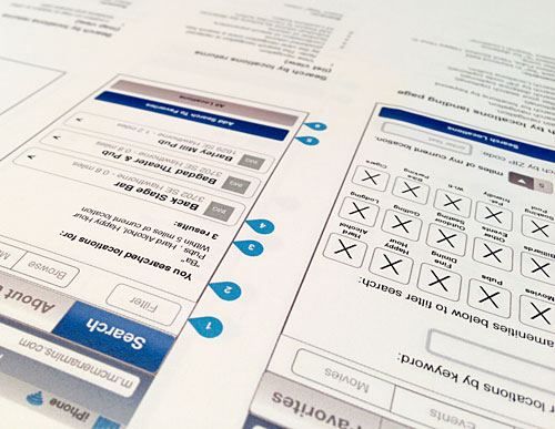
As far as deadlines were concerned, we were all working under a compressed timeframe. In order for the design and development to be completed in time for the deadline, we decided to start working with the wireframes to build a prototype of the site before any of the design was finalized. This helped us immensely. Not only was this critical to keep us on track with our deadline, but we were able to iron out any functionality bugs that we encountered that might not have been obvious in the wireframes.
Frontend and Backend Development
jQuery mobile was the base framework we used for the site. I am not sure how much this helped us in the long run. The default styling in jQuery mobile was very handy when making the prototype of the site, but I am starting to question its value when building out full, custom mobile sites; especially if you are not taking advantage of its built-in ajax functionality. The thing about jQuery mobile is that it applies many classes and styles via Javascript. With this being the case, it can be a bit of a chore to strip off this presentation layer and apply your custom design. You can, however, turn off the default styling on individual elements by setting their data-role to ‘none’, and this was something we used a lot. With this in mind, our next mobile project will probably be built by hand instead of starting with a framework. It will be a good exercise to see if the framework is helpful or just a hinderance.
Once the designs were finished and ready to go, we had a good foundation already built with the prototype. At this point we focused on slicing up the designs and writing all the front-end code.
As the front-end work continued, we progressed with back-end development and pushed toward our first round of UAT testing with McMenamins. To the casual observer, what you see on the mobile site seems to just mimic what you would see on the full site. But just like any development project, there’s a lot in the back-end that you don’t see (and that’s good!). And while our back-end development might say “I just took their data and made it match what’s on the mobile site” – they are being modest in saying it wasn’t a huge undertaking.
Data on McMenamins databases are built to accommodate the multiple types of locations (or properties) and the multiple joints within them (like bars and restaurants). They cater to the multitude of events that occur throughout the year (like movies and concerts) that have a complicated intermingling of multiple acts, bookings, and multiple showings. The goal was to make searching seamless, so that a user could easily search for that bar inside the Edgefield hotel (instead of guessing what property it was part of), find that show for that local band (without having to know the bigger event they are part of), or see what movies are playing today and tomorrow, displaying all of the times for one movie in the details.
To make the mobile site work, we utilized a lot of tools to help us reach that end-goal. We used HTML5 local storage to be able to store a user’s favorite searches or locations (without having to create a profile or store the information within cookies). We enabled geolocation so users could search within a distance parameter of where they were located. And to enable all of the searching functionality – pulling the data from McMenamin’s databases and displaying it in a way that is sorted and tailored to the user (pretty much everything on the mobile site) – we leveraged Sphinx searching.
Set Your Sites to Mobile
Mobile websites are no longer a nice-to-have. They have quickly become a must-have. Your customers are expecting a tailored experience with your website on their phone. McMenamins realized this and have done an excellent job creating this experience. From here forward, features can be added and the mobile site can gain even more functionality. It has been great working with both McMenamins and R/West on this project.
How does your website function on a mobile device? Give us a shout to see what we can do for you.