 The
The 
We have been using Bootstrap as our go-to frontend framework for a few years now and it has been working great. Frontend frameworks, like Bootstrap, are great for building basic structural aspects of a site while disabling any presentational components that aren't needed. This makes for a good starting point with new projects and allows us to customize the framework to fit the needs of the project.
It was a little over three years ago when Bootstrap 3, the current version, was initially released. While this version of Bootstrap is working well, we are always looking toward the future to see what is next. The next version of Bootstrap is on the horizon and currently has an alpha release. Let’s take a look at what Bootstrap 4 has in store for us.
IE8 Is Out
Bootstrap 4 is removing support for IE8 and iOS 6. This seems like a logical step forward and yet still very compatible, as far as Internet Explorer is concerned. Google dropped support for IE8 many years ago and now only supports IE11 and up. As time marches on, we see Internet Explorer’s dominance decrease to the point of being an afterthought on some projects. If you need to support either of these platforms, that version 4 is losing support for, you should continue to use Bootstrap 3. Otherwise, onward and upward!
Sassy
Initially, Bootstrap was written in Less. There has been an official Sass port of the framework for many years, but the framework was based in Less. I’m happy to see that Bootstrap has switched to Sass for its source files. This will make it easier to include in our Ruby on Rails projects since you can now use the official code instead of a port of the official code.
Smaller Is Better
The grid has been updated by adding a new breakpoint size for “small.” The small breakpoint is now 544px and up. This will give a new level of responsive control and prevent the grid from dropping into the smallest screen mode too soon. With this change, all existing grid sizes move up one notch. For example, a Bootstrap 3 medium breakpoint will now be a Bootstrap 4 large breakpoint. This will be an important distinction when upgrading sites from v3 to v4.
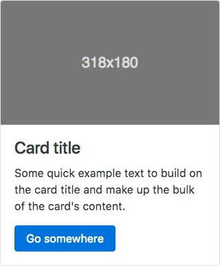
It’s in the Cards
A new component coming to Bootstrap is called Cards. This is a flexible component that is taking the place of wells, panels and thumbnails. With modifier classes and internal elements, you have support for headers/footers, navbars, images and more. It is nice to see them removing old components and reworking them into a single, extendable one.
The Utility Belt
One thing that Bootstrap has been lacking is a better set of responsive utilities. This is one area where Foundation has always had a slight edge on Bootstrap. With version 4, Bootstrap is fixing that.
First of all, they have revamped the hidden and visible classes. You now have only .hidden-size-up or .hidden-size-down. These hide all elements above or below the stated breakpoint. To make an element visible at a breakpoint, you simply do not hide it. You can combine these classes to show an element when you need it. For example, you could use .hidden-sm-down and .hidden-lg-up on an element to only show it for the medium breakpoint.
The utilities I am most excited about are the ones for floating elements and aligning text. For floating, the .pull-left and .pull-right have been replaced with .pull-size-left and .pull-size-right. Similarly, the .text-left, .text-right and .text-center have been replaced with breakpoint specific classes. With these you can change floats and text-alignments at different breakpoints, which is very handy when building responsive sites.
Wrap It Up
These are just a few of the new features of Bootstrap 4. Since this is a major rewrite of the entire framework, most of the components have been revised in one way or another. It is awesome to see this project move forward and progressively evolve through the years. Bootstrap 4 does not have an official release date yet, but you can keep an eye on the Bootstrap blog for updates on its progress.