Google Analytics: Learning to Track Behavior within a Lightbox
Reading time: ~ 4 minutes
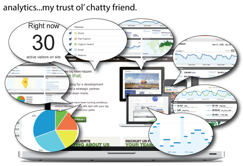
I’ve used Google Analytics, like most of you, I’m sure. But to be honest, I’ve always been slightly overwhelmed with it, too. I know there are a lot of analytics options out there, like Chartbeat for real-time, user-friendly information, and Crazyegg for interesting visuals like heatmaps for click-through rates and scrolling patterns. But, despite some hardships, Google Analytics has always felt like that trusty old friend…that one that talks too much. You know the type. The friend that gives just a little too much detail to a story to successfully get the point across (and you’re lucky if you don’t get sidetracked into some sort of tangent).
That is the best way to describe my love-hate relationship with Google Analytics. I sign in and then-WHAM-I’m hit with charts, tables, and ratios that remind me of my high school calculus class (which I can’t actually remember so I have to use tooltips to help me along). I find myself peeling away at layers of information wondering which bits are useful and which are not, and what it all means anyway. I always find my way to that one snippet of data I was searching for, but with the powerhouse of information, I wasn’t sure if we getting everything we could out of our analytics report. And with a new design launched, I realized we weren’t.
A new design for Planet Argon
A few months ago we started redesigning a few of our landing pages. We wanted users to interact more with our pages and also “show” more of what we can do (instead of telling). We knew the design at that time wasn’t suiting those needs as best as they could. So we dedicated some time to re-strategize and recreate the user experience.
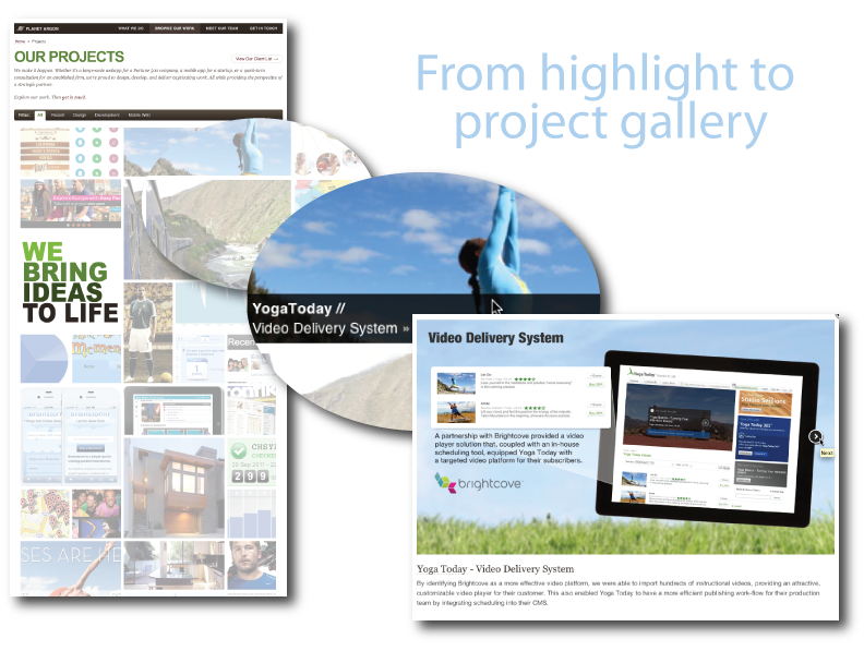
One of our redesigns was our Projects page. This new “portfolio” of work shows a collage of project images that users can hover over to get some detail and click (or tap for mobile) to open a lightbox with more detail. From there, they can paginate through the images like a gallery – OR – they can select links within the popup that directs them to the client page or a blog article about the project.
What’s really going on here?!
It was a big change from how we presented our work in the past and we were hopeful that this might provide a little more interest for a potential client (or maybe a job seeker) and give a little more reason to get in contact with us. After tracking a few months, we saw pageviews increase for the new project page, but we also saw a larger bounce rate. Moreover, we had no idea how they were interacting with the page, because the entire page was an interaction with a lightbox (or a non-page). Was our design working? Were people even look through it? Or were they just closing without even viewing? Was it meeting our goals? We had no way of knowing until we added a little trickery into our code.
A way to track interactions: Events vs. Pageviews
One of the greatest tools of analytics is its ability to let you understand the behavior of converting users to better engage with future customers. But with our new design we quickly learned we created more of a black hole when it came to uncovering behavior.
The issue became evident when we realized how we were recording user interaction. We treated the behaviors of clicking and gallery viewing like we had been for similar interactions (like downloading) – as events. It’s common practice to employ event tracking for these different types of interactions on a page, like playing a video, so you can see how users interact with the elements on a page. But because our Projects page was entirely built on interactions (and a lot of them), this data was just not enough. People went in but we had no record of what happened next. That couldn’t help us understand users, and that definitely couldn’t help us understand if our new design correlated into more people contacting us.
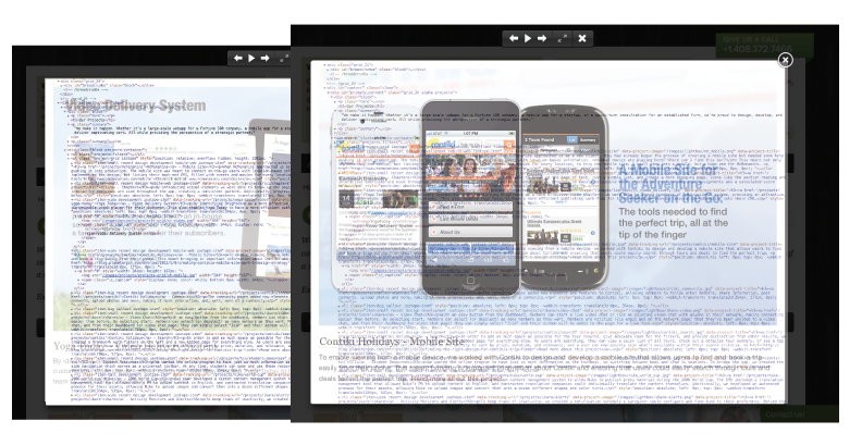
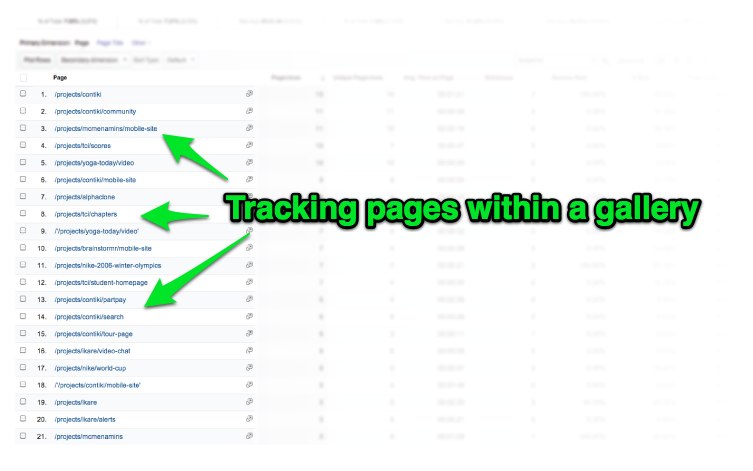
So we created a workaround. We knew what type of behaviors Google Analytics tracked for pagesviews. If we could tell Google Analytics that each lightbox image was actually a new page, that could be picked up and tracked in our reports. So each time the slide changed in the lightbox, it would send another JS call to a new pageview. Thus making each lightbox, its own page.
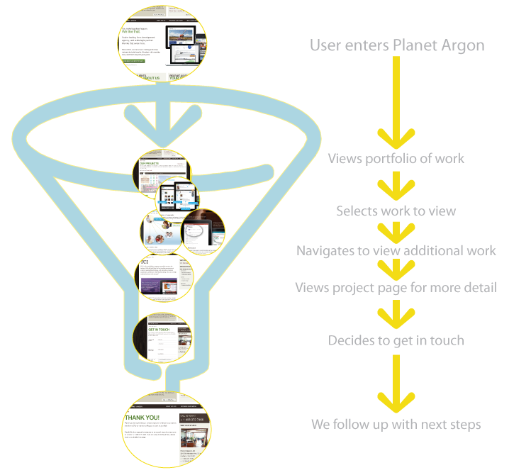
Sure, it was a “faux” page, but now we could track where users entered the gallery, how many images they clicked through and where they went from there, instead of capturing just that one bit of a data for the whole page. Moreover, we could now view these pages as part of the funnel, showing the path from entrance to conversion.
The Result
We just made these updates, so it’s still early in the tracking, but we’ve already seen some benefit to the changes. Instead of seeing that people viewed the main page, now we can actually see how, when, and if people interact with the page and even begin to make assumptions on what they find the most interesting. More importantly, we can see how many use this information to initiate a conversation with us, which is our end goal. And, as we track how this page is used, we may even be encouraged to make modifications to our design based on what’s used and what’s not.
For a little guidance
If you’re looking to flex your google analytic skills a little more, I highly recommend Advanced Web Metrics. It offers information and insight for the marketing focused, for the technical, and everything in between. Working through this book alongside our site in Google Analytics was extremely helpful, and even uncovered a few things we weren’t aware of, like our site speed on some of our pages.
Have a tip you want to share?
Include it in our comments below. We love getting information from our community.
Or are you looking for some analytics help on your application?
Get in touch with us and we can help you improve how you’re tracking user behavior.
