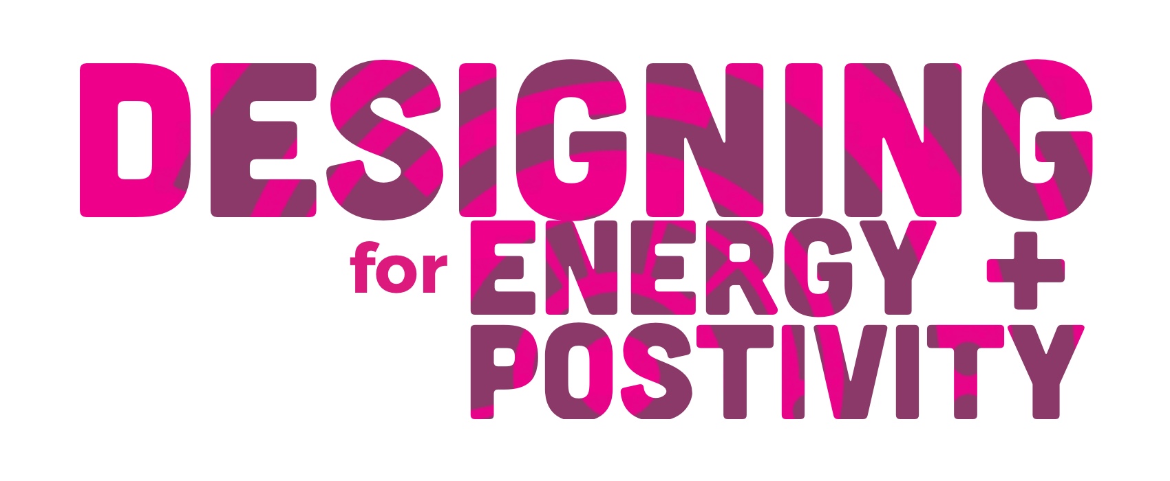
High-end. Customer-focused. Motivating. Tech-driven. Respected. Trusted. Simple.
Those were some of the words our friends at Wheel House San Francisco shared when we asked them to describe their company and how they wanted to be perceived. Over the course of the next year, we took those words, understood what they meant, and created a new site that better embodied those values and their brand. This post describes the challenges at hand, and the opportunities and solutions we found when redesigning www.wheelhouse-sf.com.
Understanding the Starting Point
When Wheel House approached us, they had a site that worked, but wasn’t what they had envisioned. Weeks before their launch, they pulled the plug on the CMS software they were using and quickly found a different partner through ZingFit to handle their studio administration, as well as, power their website.
It got the job done, but it lacked the positive experience they provided in the studio and the functionality they needed for their customers. Some of the issues they faced were:
- Their brand identity was lost in a mundane and uninspiring design.
- First-time users lacked the guidance they needed, and often couldn’t find information to get started (resulting in frequent calls to Wheel House or, worse, abandonment).
- Scheduling felt cumbersome to customers, even regular users.
- The site wasn’t intuitive or straightforward, making time on site longer than was necessary.

Wheel House’s old homepage

The list of classes offered, with little interaction or engagement

Studio pages unformatted and uninviting

Instructor page often unformatted and difficult to use
Simply looking to solve those problems wouldn’t be enough, though, as there were underlying challenges that needed to be addressed like
- Being able to reimagine and redesign the site within the third party platform they were using to power the entire site as well as manage their bookings.
- Knowing how best to accommodate two types of users (new vs regulars) without muddying the application with extra information or layers of content.
- Providing necessary tools and ensuring seamless and efficient transactions, even within the confines of their application.
- Keeping the CMS straightforward but flexible for Wheel House staff to continuously maintain in the future.
- Being able to infuse the high-energy and motivating in-person experience into the web design.
How we guided the team to the solutions
Ensure we are all starting from the same point

The original wireframes became a jumping off point
Like most of our projects, we wanted to understand the entire picture before we started thinking of solutions. This meant walking through wireframes Wheel House had already started creating on their own and discussing the issues and needs they and their customers faced to get them where they were. We also discussed the project with ZingFit, to ensure we had set clear expectations with all teams, defining what we could do, what would not be possible, and how we would proceed. Since ZingFit would be integrating all of our designs and code into their codebase, it was essential that we set those expectations early and maintained clear dialogue.
Set the mood with inspiration boards
One issue we could see right away was the disconnect between the in-person experience and the website. The current site lacked any energy or movement and it bore no resemblance to their brand, or the mood and inspiration the actual studio provided to its customers.
That missing piece meant that no matter how much functionality was added, the site could never inspire a customer to join if this disconnect was not addressed. To lessen that gap, we wanted the new site to resemble the in-studio experience with visual engagement. That way, new customers didn’t have to read what the class was like, they could see or hear for themselves. The color, typography, and style of imagery became a bridge between studio and site. Using mood boards to start, we agreed on a method of tying the brand to the site.

Turning words and brand style into a style guide for the web
Translate User Goals into Designs
Once we had a visual guide, we could continue with design strategy, identify user workflows, and prioritize content starting with the homepage. The homepage organically becomes a snapshot of the entire site, from who Wheel House is, what they do, how one could join (either with an upcoming class or buying a package), and more.

Wheel House’s new, redesigned homepage filled with imagery and engaging content
From the homepage, we worked on top-down content focusing on the audience and the user needs, whether it’s to on-board and provide one area to get all information, or provide a regular customer with their accounts and schedules.

A new drop down menu invites users to explore content and information

New content to help on-board customers and walk them through the process to get started
A Roadblock (or Two)
One issue we heard from customers was that retrieving account information was a series of unintuitive steps. Getting to this information required a user to select Account Info from the header, which would then take them to an account page, then they’d use the page navigation to get to the information they needed.
To address this, we designed a way for a customer to get a quick peek into their upcoming classes and remaining balance right from the header. By doing this, we could ensure once they logged in, they could view this information at a glance from any page, and not lose their spot or have to travel down a series of links.

Our proposed drop down menu to show customers at a quick glance their account details and upcoming classes, without being redirected
We designed this to be a modal that would show relevant information with a link to the more detailed account pages. While designing this on our end was a snap, to enable this to work in ZingFit’s platform proved a little more tricky, as their templates are not easily manipulated.To get around this, we enlisted help from our backend development team to use a little Javascript magic to customize the header and scrape info from the account page to show in the modals.
The Final Mile
Because we took time to understand the issues and challenges, we were able to work with all parties to come up with feasible solutions and workarounds to meet the user and business needs.
By designing a focus around visuals and striking color, we were able to display the power and energy behind the brand. We opened the door to explore more movement on the page with videos and audio. And the site now speaks with, rather than at, each user directly with content architected specifically for the user type, whether new or a regular.
There may always be limitations, regardless of third party platforms. The hope is that you never stop at “can’t” and instead determine workarounds and solutions, especially when it could simplify the life of the end user. Workarounds allowed us to avoid “can’t” scenarios and turn them into “how can we” solutions. For Wheel House, this meant that we were able to use the platform they had to create a wonderful experience for the end user..
Words like high-end, customer-focused, and simple are no longer words used to describe, they are now themes that are present on the site.

Fun and engaging instructor profiles allow customers to connect

Class information goes beyond description and walks through stats, reviews, instructors and more

An organized FAQ keeps information easy to scan and read