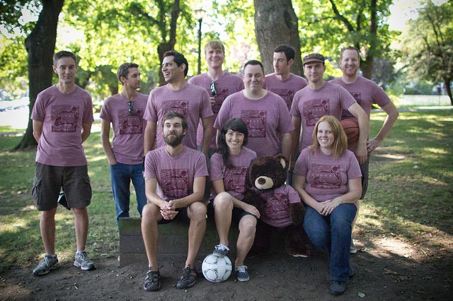
Just a few weeks ago, we celebrated our 2012 summer picnic at lovely Irving Park. Now, as the mercury drops and the giraffe-fur coats come out of their cardboard boxes with puffs of toxic mothball dust, we ease into our creaking rocking chairs, reflections of the waning summer dancing in our minds like so many whistling embers leaping from the nearby hearth. “Why didn’t I go to the river more often, goddammit?” we contemplate; or, “I squandered this whole summer sitting at my desk, eating cookies, listening to the sound of my muscles atrophying, and now it’s dark when I wake up and where did I put my raincoat?” Oh, tut-tut, you silly goose! It’s only October- the weather’s still gorgeous and the leaves in your backyard make such a delightful crunching sound.
But the autumn season is indeed a time for contemplation, so let’s relive some of those joyous picnic memories once again: there was the beanbag toss, the piñata destruction, the delicious meal. Oh, and of course, there was the picnic t-shirt that everyone pretended to tolerate. What was the design process of said t-shirt, you ask? Great question!
First, pick a theme:
Quick- first thing that comes to mind? Uh, tacos. Go with it! Everyone loves tacos, so it’s sure to be a crowd-pleaser. Not that you care, really- you are an artiste, and if those fools don’t appreciate your vision, they can go suck the proverbial egg.
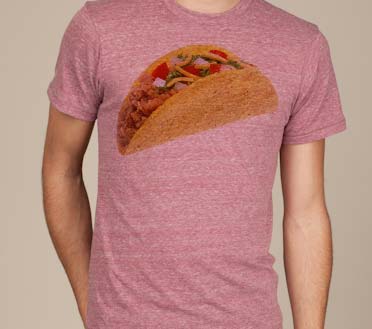
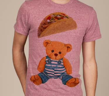
But wait, the boss wants you to include the teddy bear mascot:
Oh gawd! Nobody understands your aesthetic! You can’t just “drop a bear into the design somewhere.” What the hell do bears have to do with tacos? Ugh, fine!
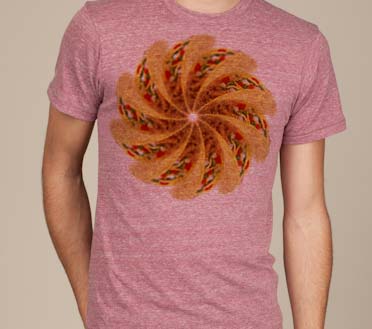
Multiply it:
If one taco is good, 10 tacos are phenomenal!
Stylize it:
Hmm, still a bit tame. Think graffiti, pop art, skateboards- go for that silkscreened aesthetic. Let’s make it, you know, edgy!
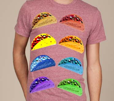
Come on, man- edgier!
OK, um… how about gunshot wounds with dripping blood? There’s nothing edgier than that, right? If you want to connect with today’s youth, you have to be bold! Make a statement! A t-shirt isn’t just a t-shirt anymore, right? A t-shirt is a billboard, a conversation-starter, a mouthpiece for individuality! Do whatever it takes to make an impression.
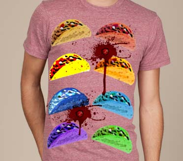
But I thought you said not to sell out, not to compromise your vision- you’re an artiste, right?
Fuck off.
You know what? This is trash, pure and simple. Start over!
Sigh. OK, well let’s stick with the vague Mexican theme… Ooh! What about papel picado? Let’s incorporate some iconography traditionally used in Mexican folk art (cactus, flowers, grid pattern) with some local imagery (Mt. Hood, rain clouds, Planet Argon logo, laptop).
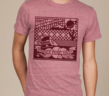
Pretty good, I guess, but I miss the tacos. And that bear was pretty cute.
Well, you can’t win them all. Anyway, check out our 2012 Picnic Flickr album for more photos of the shirt and the Planet Argon team. Also, we do way more than make reasonably tolerable t-shirts, so read more about our services or browse our work.
