We’re thrilled to announce the date of our Second Modern Web Development Workshop. This time we are headed for Seattle!
Upcoming Modern Web Dev Workshop in Seattle!
16 Jul 2013
16 Jul 2013
We’re thrilled to announce the date of our Second Modern Web Development Workshop. This time we are headed for Seattle!
3 Apr 2013
Here is a little knowledge nugget that Jack and I picked up during our time at An Event Apart: Seattle (more on that to come). We learned about this handy little site called caniuse.com that was created by Alexis Deveria. The site lets you look up HTML5, CSS, JS API, SVG, etc. elements to see what their support is across browsers. Then you can assess.. Can I use that?
We are freshly back from the conference and I have already started using and benefiting from it. Give it a look and find out what you can use. (Turns out you can use the first-child pseudo-element in IE8!)
29 Oct 2012

Your website, just like your car, is often due for a bit of maintenance. Fortunately, tuning up your website is less intimidating than that familiar experience of standing next to your vehicle, nodding your head dumbly while handing your mechanic (who, by the way, is much more ruggedly handsome than you) a wad of cash. And that is even less daunting than attempting to work on the car yourself- you’ve tried that before, and you still have nightmares and stained pants.
25 Jul 2012

I recently interviewed Thomas Fuchs, Ruby on Rails core alumnus, software developer, and author of new e-book, ‘Retinafy Your Web Sites and Apps.’ It’s a concise collection of tips, recommendations, and code snippets for web developers interested in preparing their sites for retina phones, tablets, laptops, and desktops of the present and future.
23 Jul 2012
With the functional prototype and the design work in the can, we got the opportunity to start work on the front-end implementation for Contiki’s mobile website . Since we had a good dose of working with the jQuery mobile framework from the prototype, we were able to dive right in and get to work.
29 May 2012
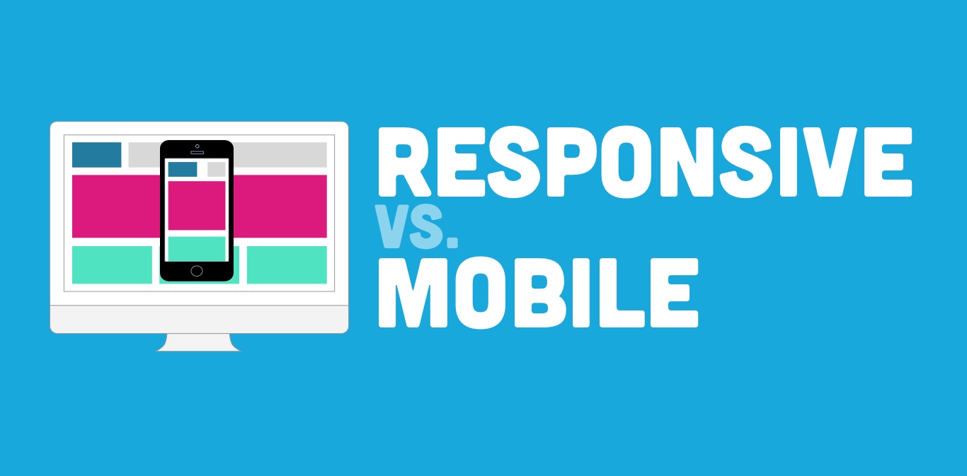
Our team is currently working on a series of white papers and have just finished our first one, which introduces businesses to two strategies for designing and developing a site that targets mobile traffic.

Given that we've approached several projects from both angles, we felt that it would be worthwhile to share our experiences of each with you.
You can now get our white paper, "Responsive Design vs Mobile Site" on "our new white papers page":http://planetargon.com/white-papers/responsive-design-vs-mobile-site.
17 Apr 2012
Peter-Paul Koch, of quirksmode fame, recently gave an enlightening presentation about the mobile viewport which, quite fortunately for all of us, is available in video and slide form. “A pixel is not a pixel”, clocking in at just over an hour, is quite thorough and enjoyably dense, so watch it. But, if you don’t have an hour to spare, this is the gist of it:
12 Apr 2012
With all of the talk about mobile best practices, some are neglecting to factor in the reality of existing sites and existing budgets. Just because you don’t have the time or money to completely revamp your site for a mobile audience doesn’t mean you shouldn’t consider a mobile strategy. A separate mobile-version of your website might be the perfect first step.
11 Apr 2012
Lately we have been doing a lot of work for clients on mobile versions of their websites. This got us looking at our own website and how it currently functions on a mobile device.
6 Apr 2012
We have been working on a number of mobile-focused projects lately and have come across some issues we don’t normally deal with when producing sites for desktop browsers.
Have a project that needs help?