Turning our attention to our main concern, the pyramid
Reading time: Less than a minute
Last week, we unveiled the new Planet Argon logo to the team. We’re delighted to now share it with you.


Where did the pyramid / triangles come from?
Back in 2002, when Planet Argon first started, our brand materials included both a planet and a pyramid in the design.

In 2003, the pyramid shape was removed to simplify the design, which we’ve been using variations of since.

When we launched our interactive timeline, we began to explore how we might re-introduce the pyramid into our branding.
Where did the planet go?
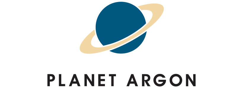
While it’s still orbiting out in space, we no longer believe that an outline of our former planet best communicates who we are as a team. Over the past 13+ years, we’ve witnessed several earthlings confuse the previous logo with other planets.
For example, “I Saturn PDX?”

As we’ve learned, it’s hardly unique.
What inspired this design?
”Satisfied with the placement of the camel and palm trees, the Red Beards turned their attention to their main concern, the pyramid. They considered the pyramid vital to the continuing evolution of earthlings, and they desired to confront earthlings with pyramids as often as possible." — Tom Robbins, Still Life with Woodpecker
You’ll see the new logo roll-out across our various products, tools, and sites in the near future.

p.s. if you’d like one of our new stickers, please fill-out this form.