Don't Rush the Redesign: Start with Strategy
Reading time: ~ 4 minutes
This entry is part one of the series: Website Re-design Series
Part 1: Don't Rush the Redesign: Start with Strategy
Part 2: Defining Redesign Roles: Designer, Developer, or UX/UI Expert?
Part 3: Design Meets Reality in Rails Redesigns
Part 4: Launch Ready: Communicating Across Teams for a Smooth Rollout
Part 6: The AI-Ready Redesign: How Spec-Driven Development Is Changing the Way Teams Build
Start with Strategy: Reviewing Purpose & Page Elements
Redesigning a website (or even just a single page) can feel overwhelming. The creative ideas are usually exciting, but turning those into a working, functional experience requires coordination across multiple teams. Before diving into wireframes, colors, or new tech stacks, it’s crucial to pause and ask: Why are we doing this? What’s working, and what isn’t?
In this first article of our four-part series, we’re laying the groundwork. We'll walk through how to evaluate your current site, starting with its purpose, then moving into key elements like your navigation, hero section, and calls to action. By grounding your redesign in clarity from the start, you’ll avoid missteps later.
Why Purpose Should Guide Every Design Decision
It’s tempting to start a redesign with moodboards and competitor analysis. But before you consider what your site could look like, start with why it exists.
Ask yourself: What is the core goal of this website right now? It may seem like an obvious question, but it’s often overlooked or overcomplicated. In many cases, a website's purpose becomes diluted over time. New content is added. Old pages linger. The result? A fragmented user experience.
For example, is your website meant to:
- Convert visitors into clients?
- Educate prospective customers or developers?
- Promote a specific new service?
The answer should inform every design choice ahead. And in today’s search environment, where AI often answers user questions before they even visit your site, it’s more important than ever to deliver a clear message and a focused experience for those who do.
Quick exercise: If a visitor only clicked two things on your site, where would you want them to land?
Taking Inventory of the Existing Site
Once your purpose is defined, it’s time to look at what’s already in place. A successful redesign starts with understanding what’s currently working—and what isn’t.
Begin by scanning your homepage and top-level pages. Focus on what users see first. What messages are you prioritizing? What actions are you encouraging? What paths are available?
Let’s use planetargon.com as an example.
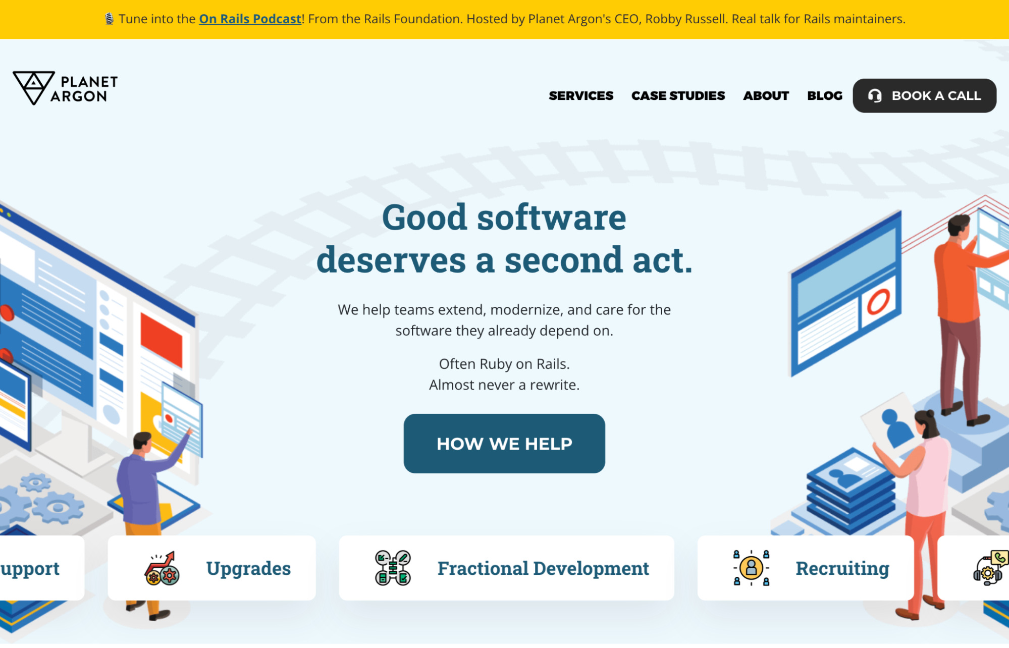
On the homepage, users immediately see:
- A promotional banner: “Tune into the On Rails Podcast!”
- A clear primary CTA: “Book a Call”
- A slogan that states our value: “Good software deserves a second act.”
- A secondary CTA: “How we help”
These elements are intentionally placed to guide users into one of two pathways:
- Schedule a call (for those ready to talk)
- Explore services (for those who want to learn more)
That’s it. No clutter. Just clear direction. These calls to action serve as anchors, helping users move confidently through the site.
Designing With Focused Navigation
After evaluating first impressions, zoom out and consider your site’s navigation structure. Site navigation is often where purpose and usability collide. Too many options? Users get overwhelmed. Too few? They miss something important.
At Planet Argon, our navigation includes only four primary links:
- Services – What we do
- Case Studies – How we’ve done it
- About – Who we are
- Blog – How we think
We’ve intentionally kept this lean to avoid friction and keep visitors focused on what matters most. Each link serves a specific function.
Think of your navigation like a tour guide: it should offer enough information to help someone choose the right path without letting them wander aimlessly.
The Hero Section: Making a Statement (Above the Fold)
Just below the site navigation, you see the hero section, the part of the page that carries your message and your momentum. This is often the most valuable real estate on your site. It's where you tell people why they’re here and what to do next.

Our hero includes:
- Our slogan, which acts as a guiding message
- A brief blurb that supports the slogan and offers clarity
- A strong CTA that invites users to take the next step
All of these are designed to work together. When done right, the hero gives users just enough to either engage directly or dig deeper. It should be emotionally resonant, visually clear, and friction-free.
Reminder: The hero section should reinforce your site’s purpose and provide a clear next step. Avoid distractions. Prioritize clarity over cleverness.
Different Brands, Different Priorities
Of course, not every site has the same goals. Let’s look briefly at two other examples.
AppSignal
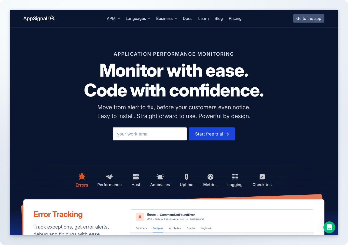
AppSignal serves a more technical audience. Their homepage hero includes:
- A large, purpose-driven headline
- A CTA: “Start Free Trial”
- A breakdown of core features: Errors, Performance, Host Metrics, etc.
This structure supports their dual goals: to communicate value and invite immediate action. It’s functional and informative- perfect for their user base, which tends to be more technical.
Kamp Grizzly
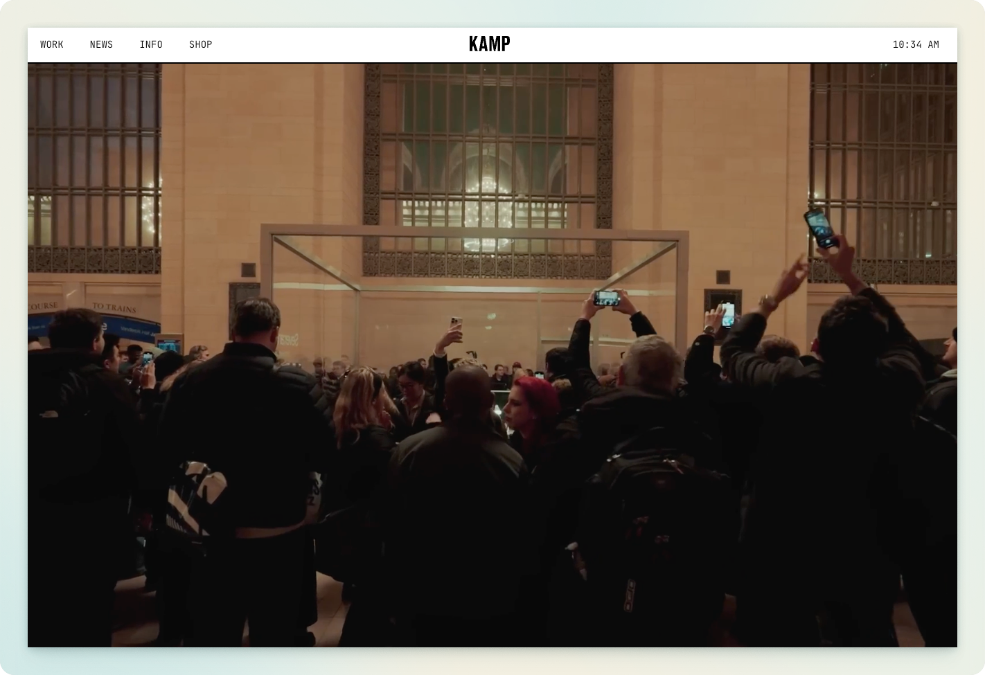
On the opposite end of the spectrum, Kamp Grizzly, a design and marketing firm, lets its visuals do the talking. Their homepage prioritizes immersive imagery and portfolio storytelling over CTAs.
For example, a full-screen video from a Severance event they created dominates the landing experience. Their audience already knows who they are; they don’t need to sell with buttons. Their work is the message.
Key takeaway: Align your homepage structure with your audience's expectations and your brand strategy.
What Comes Next
Every website redesign includes dozens of decisions—but getting aligned on purpose makes each one easier. By reviewing your current design with a clear eye, you can identify what should change, what should stay, and what needs clearer communication.
Here are the three questions to keep front and center as you move forward:
- Why are we redesigning this site?
- What message do users need to hear first?
- Where should they go after landing?
In the following article, we’ll tackle a question that many teams face early in the redesign journey:
Do you need a designer, a UX/UI expert, or a skilled front-end engineer?
We’ll break down the roles, how they overlap, and how to choose the right talent based on your project’s goals.
Stay tuned.