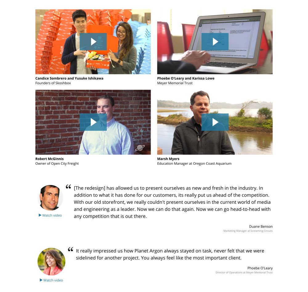
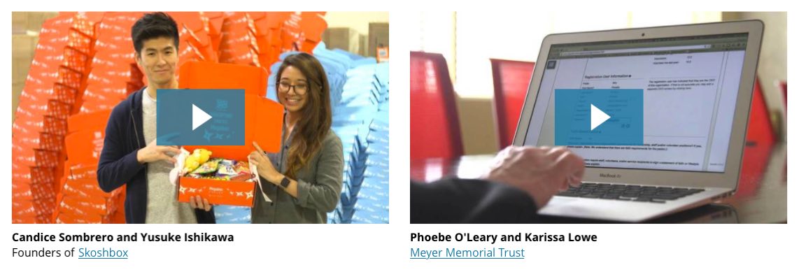
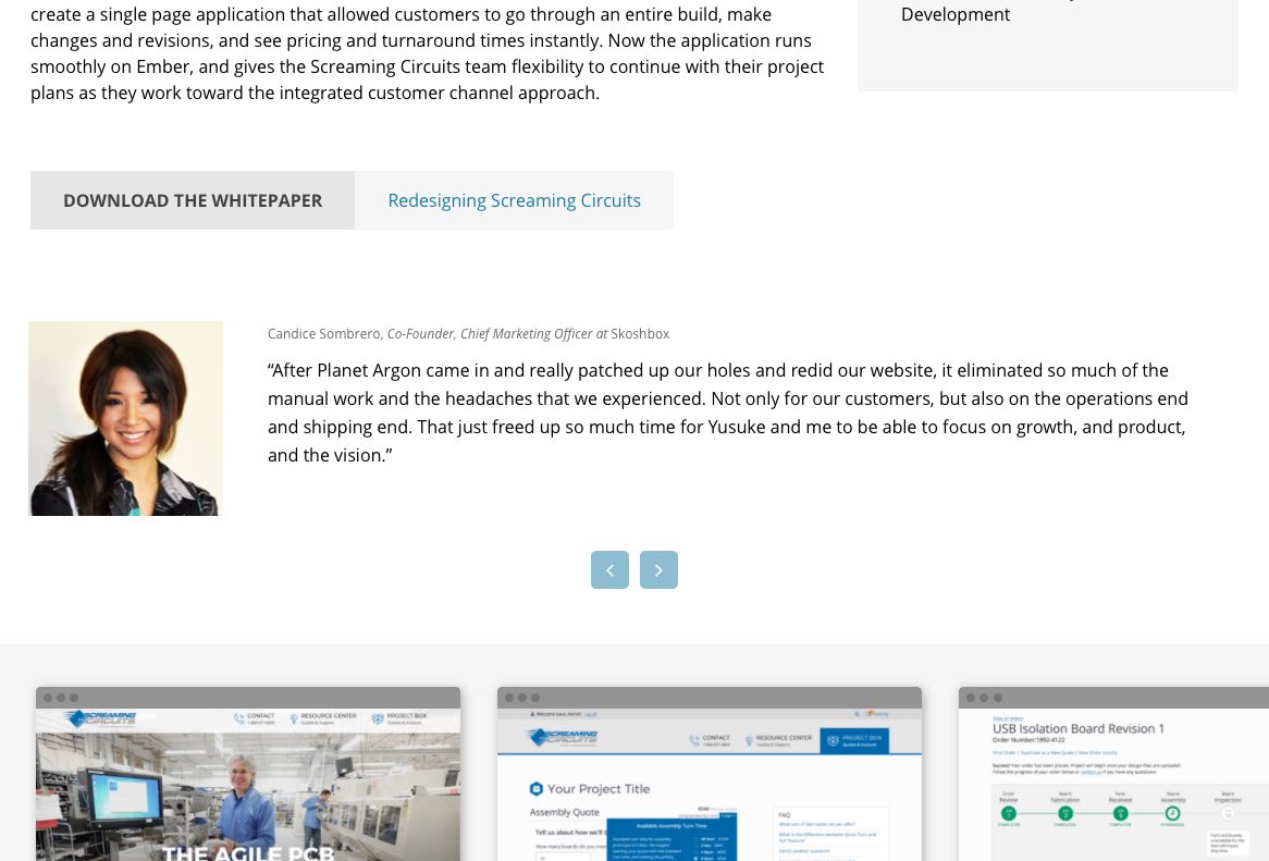
It started with a simple question: Would it be possible to link through to case study pages from the Testimonials page? When I was tasked with addressing this issue, our Testimonials page was basically a dead end – a visitor could read or watch testimonials, but wasn’t invited to explore the projects that were being described. As I re-familiarized myself with this page, I found some more opportunities for design improvements. While I was iterating on design ideas, I kept track of the entire process because I thought it’d be interesting to see all of the decisions that ultimately become a minor page redesign.
Step 1
The easiest thing to do would be to simply link the company name to the appropriate Case Study. But, is it obvious enough?
Step 2
For increased clarity, I separated the link into a View Case Study button. I also tried “View Project” and simply “Case Study” but, in general, we try to include a verb in a call-to-action (CTA). Alternatively, I thought a text link might suffice, as the border button adds weight to the area, but I don’t love either option. And as the device or browser shrinks, the link and the client info would quickly collide. Any responsive design will need to confront this challenge, but this just feels more brittle than necessary.
Step 3
I started to work on adding the Case Study CTA to the secondary testimonials. Again, with the addition of the border button, the element feels lopsided. I’ve also noticed that, with or without the CTA, the company info throws off the balance. I’d like to play with left-aligning the entire block, including this info.
Step 4
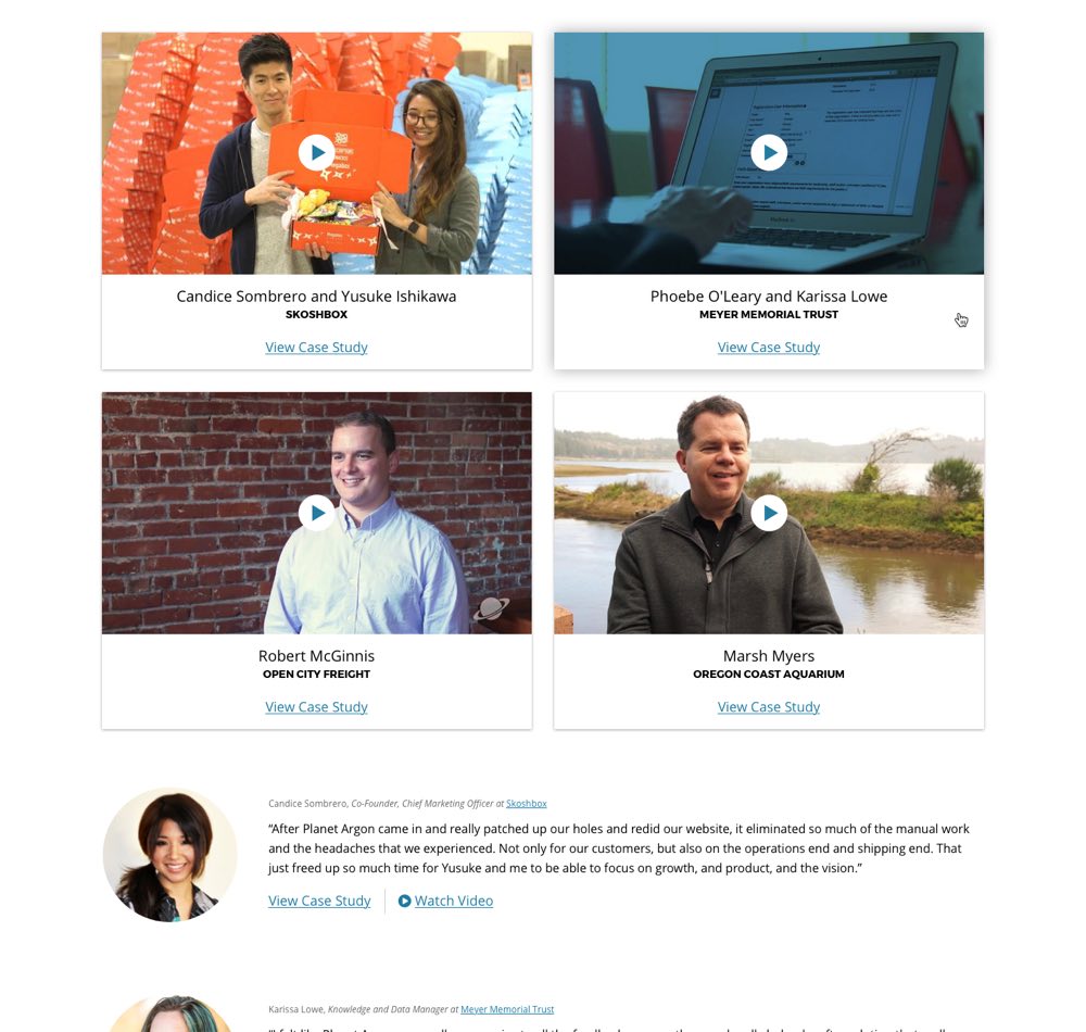
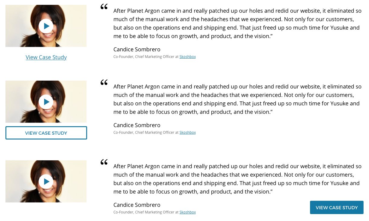
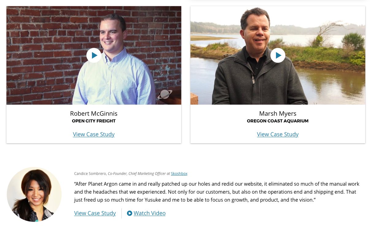
Back to the primary testimonials. We have a “tile” design pattern that we’re using for the homepage as well as some sub-pages and it’d be nice to leverage this style. This would add consistency, contain the testimonial elements, and take advantage of a hover state I’ve already established. I also tweaked the style of the play button on the testimonial video stills – I wanted something smaller and friendlier.
Step 5
At this point, I replaced the circular secondary testimonial images with rectangular photos. I also moved those testimonial images to the right side and left-aligned all the text. I liked this – it was fun to get rid of the circular photo masks and try something different.
Step 6
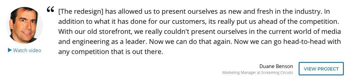
Focus, Jack! Although I’ve juggled the elements and tweaked the styling, I haven’t addressed the original issue: I still need to find a good spot for the Case Study link in both the primary and secondary testimonials. I tried putting the Case Study link under the secondary testimonial photo, but it felt a little disconnected. I wanted to move it into the main text body, but the combination of company name, person name, testimonial, and Case Study link was just too heavy. I consolidated the company and individual names into one block and deemphasized it by making the text smaller and lighter. If the elements within a block don’t have varying degrees of prominence, the design will feel unrefined.
Step 7
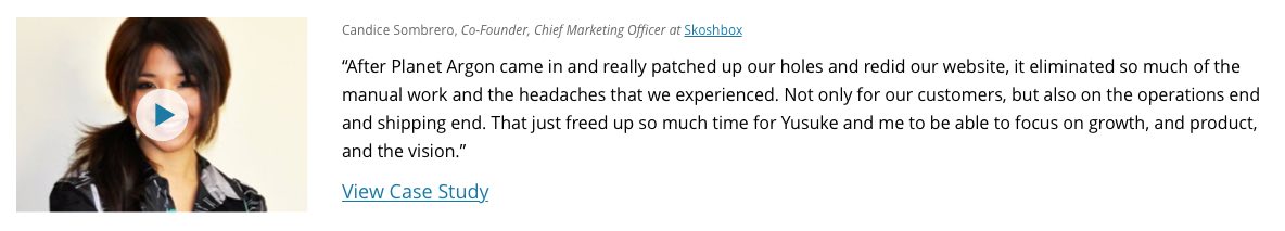
With the client info consolidated, I have space to add the “View Case Study” link. Now, it doesn’t feel like it’s competing with the other elements. I also moved the client photo back to the left – I think it works on either side but, for some reason, it feels more visually balanced with the images on the left.
Step 8
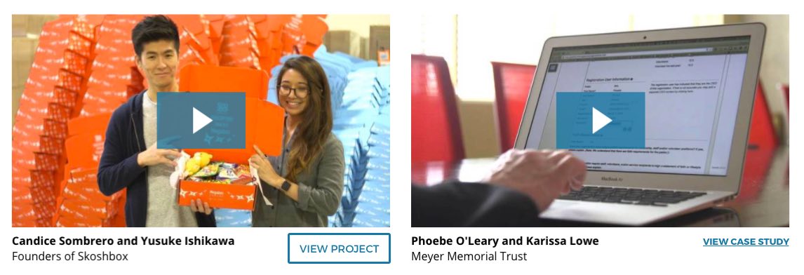
Back to playing with the View Case Study treatment on the primary testimonial tiles. Do I simply link the company name or have an explicit link to view the case study? I’m leaning more toward the separate link because the company name might lead to a page dedicated to that one client, a page dedicated to all clients, etc.
Step 9
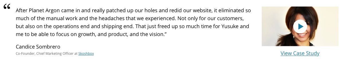
Annie, our Design Strategist, suggested a couple reasons why the play button over the secondary testimonial image could be problematic – it covers a portion of an already small image and those photos, unlike the images in the primary testimonials, aren’t video stills (not all secondary testimonials have video testimonials, so these images are simply images of the client). So, it was time to play with some alternative ways to link to the videos: button / text link next to the Case Study link; subtle text link at the bottom of the image; or, if we chose rectangular images, button at the bottom of the image.
Step 10
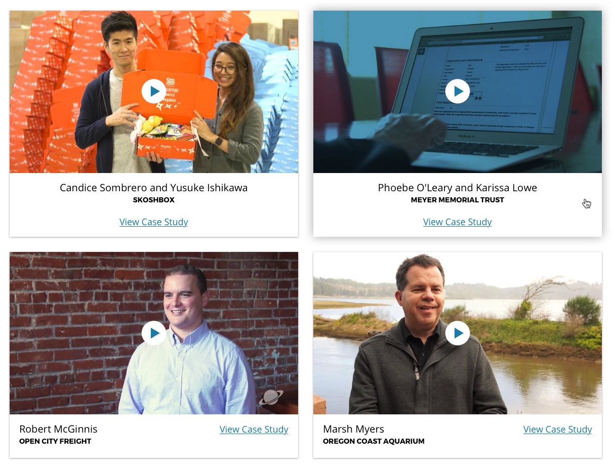
Around this time, Annie reminded me that we use this secondary testimonial pattern on Case Study pages. While we can break the pattern and treat these testimonials differently, it makes sense to stick to it unless we have a good reason not to. So I need to make sure that whatever changes I make here also work for the Testimonial slider on the Case Study pages. This led me to revisit both the circular and square testimonial images. The landscape-oriented rectangular images look good, but it would require re-cropping the originals or finding new images entirely. This isn’t a deal-breaker, but should be avoided if possible.
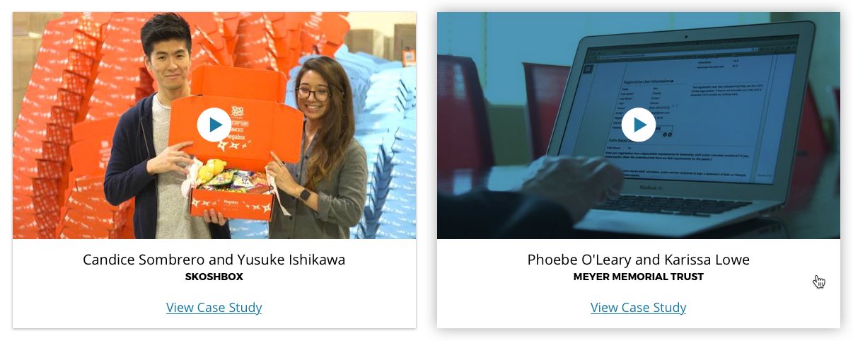
Step 11
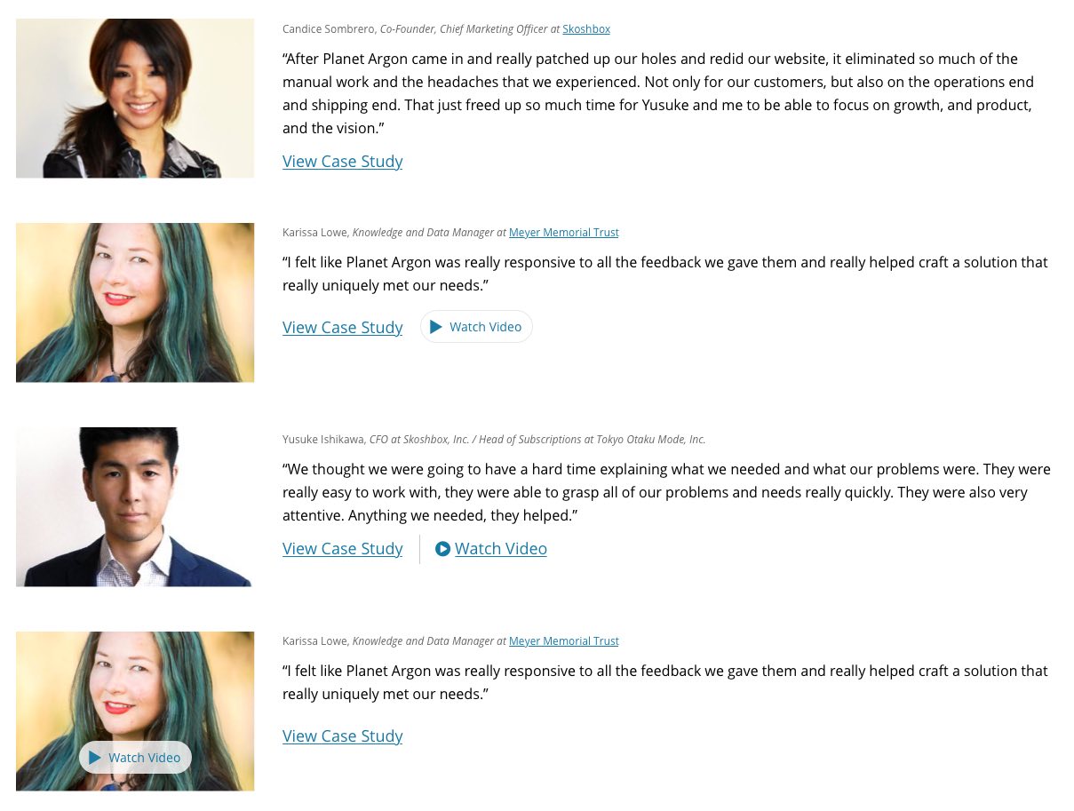
OK, final decisions made. Annie and I both like the landscape-oriented rectangular photos because they feel elegant and active but this orientation would require new images. So we decided to stick with the round format and revisit the decision after the other changes get implemented. We also decided to go with the secondary testimonial Watch Video link that’s inline and styled the same as the View Case Study link. Although the buttons are a little more interesting, they’re also a bit excessive. For the primary testimonial Case Study link, we’re putting it below the company info, all center-aligned. While the link off to the right and the company/client name to the left is a more efficient use of space, it’s also more finicky – once the device starts to shrink, those 2 chunks of text will collide and that will need to be dealt with.
Done!
Check out our redesigned Testimonials page and chime in with any feedback or suggestions – I’d love to hear it all!