When summertime comes, it’s a chance to get outside – barbecues, picnics, swimming, hiking, camping. And for many, it also means summer music festivals.
When I was three years old, my parents volunteered at the first US Festival, held in my birthtown of San Bernardino. The festival was conceived by Steve Wozniak (you know…that one guy) as a way to veer away from the 70’s “me” generation to more of an “US” generation (get it? US Festival).
His hope was to bring together communities by getting the best bands of the time and combining that with technology (the festival was one of the first to use a jumbo screen). Unfortunately, the festival only lasted two years, cost Wozniak a lot of money, and all that is left are the great memories of those who attended (and my current favorite t-shirt).
Now more than thirty years later, festivals of all genres and interests are organized every year around the world and are inseparable from the technology that makes it all happen. And it’s not just the technology that appears at the festival (like jumbo screens and holograms of dead artists). It’s also how we connect to the festival, before, during, even after, the event, that completes the experience. From schedules, to buying tickets, this is a comparison of the online experience of a few well-known (and some unknown) festivals.
Coachella

Background: Coachella was actually the first festival I attended, in 2004. Things have changed DRASTICALLY, from length, to food, to camping options (you can actually rent an air conditioned tent with a concierge). This festival has definitely turned into the see and be seen for celebrities and non-celebrities alike, with top music acts around the world participating.
What works
- A responsive layout is key, as most turn to their mobile devices (especially at the event).
- The homepage is a definite starting point for all their content and is organized to encourage exploring. This is clear as you veer away, and the actual navigation is minimized and organized within a hamburger (see image below).
- For a site that has a lot to tell (from where to stay, what to eat, what to see, and more), it doesn’t feel overly complicated. That might be due to the content organization in the menu.
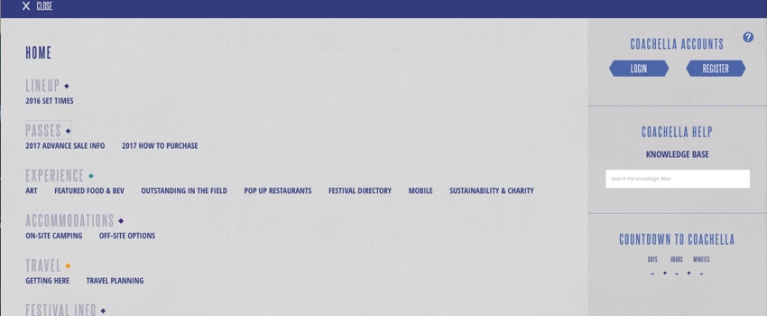
- The lineup allows you to save your own schedule (making it a lot easier to keep track of the artists you don’t want to miss).
What could be improved
- While the lineup and schedule is easy to use, I do wish there was more to engage with the artists. Maybe a description? Maybe some inline player instead of links off to the app. Nothing really allows exploration. And on smaller devices, the image goes away, and it’s just copy. Boring.
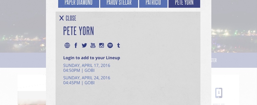
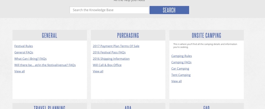
- Having a dedicated knowledge base is helpful and Coachella’s is organized. But this type of simple table of content could do with some extra guides to make browsing the content easier. As it is, it just looks like a lot of content that you might feel compelled to look at everything.
Pickathon

Background: Started in 1998, Pickathon today is a 3.5 day music festival, featuring bands on various “stages” within 80 acres of farm nestled in the woods outside of Portland. It’s also the only outdoor music festival in the US to minimize all single-use cups, utensils, and dishes. It’s also my first year going this year, and I’m super excited!
What works
- It’s responsive. Yay!
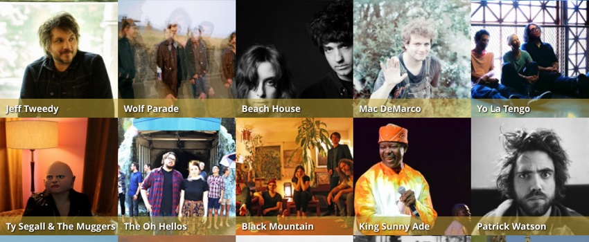
- The lineup is a standard grid, and seeing the names is helpful (there is one example in this comparison that does not do this, and so hovering, unfortunately, is necessary).
- The Artist profile includes a nice summary and a helpful link to their artist page on Spotify (since the link triggers my desktop app, the music can play as I can continue to browse).
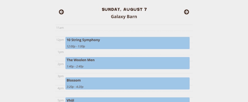
- I might be in the minority when I say I don’t mind my gmail calendar, and the schedule is very reminiscent of that.

What could be improved
- It would be great if there was a filter or a way to sort by the day on the artist grid, just as an additional support to the schedule tab.
- You can subscribe to the entire calendar, but this feels like extra work to the end user. Now I feel like if I want this to be useful, I have to weed through each day, and delete the bands I’m not interested in seeing. It’s more probable I’ll just unsubscribe to this feed entirely instead of dealing with this. Instead, I wish there was a way to be able to save calendar dates or favorite the date from the artist page so you could create your own schedule from an artist page. Opt-in, right?
- Though it’s responsive, one festival did create an app – and while that requires extra work, it may be a better alternative depending on cell reception when you’re in the middle of a forest.
- The mobile schedule shows each stage as its own list with arrows to toggle between stages. That’s not entirely intuitive to me, as I’ve associated arrows next to dates to toggle dates. But an easy check and you can figure it out.
- A short video loop could also be very enticing to complement the great images.
Pitchfork Music Festival

Background: Annual summer gig that’s been running for over ten years in the Chicago area, this festival is run by Pitchfork Media featuring artists primarily from alternative rock, rap & hip-hop, electronica, and dance music.
What works
- Responsive! Yay! (though it’s responsive in that everything just squeezes down)
- The design is lovely (though there might be some issues in accessibility).
What could be improved
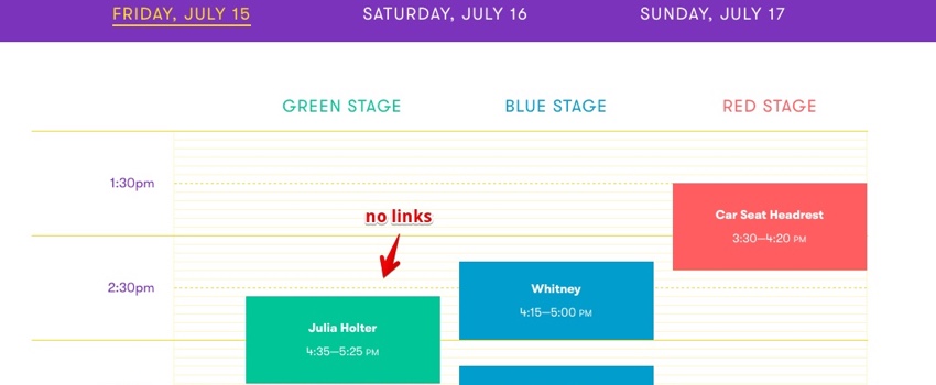
- There’s no information on the bands playing, there’s just the schedule with a list of artists.
- The nomenclature used for navigation could be improved. With both “Explore” and “Info” I kept selecting Explore thinking it would give me information on the artists. But it was really more of information.
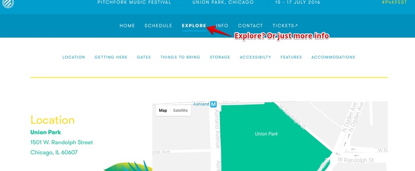
- The design is great in a lot of ways. But I did find that the yellow copy (like above) was a little hard to read. Yellow is just a hard color to pull off.
- Additionally, there’s no photos of the event (though there is a great library of videos and photos that were collected/archived AFTER the event).
Glastonbury Festival

Background: One of the older festivals in this comparison, Glastonbury started in 1970 (though it didn’t become an annual fixture until the 80’s). It spans 5 days and take place at a farm in the south west of England. Its aim is to “encourage and stimulate youth culture from around the world in all its forms", from music to art and design. It boasts over 100 stages and over 100,000 attendees every year.
What works
- Responsive! Yay!
- Search is helpful especially given that there’s a lot of information here.
- The view by is helpful (to be able to view by stage or by artist).
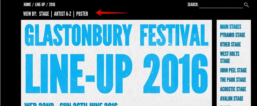
- They encourage others to share photos, which makes it easy to see what the festival is like and get on board.
What could be improved
- This is a large event and I wish there was better navigation for a first-timer. As it stands, the homepage has so much information; also, the autoplaying carousel is jarring. A dedicated section on “what you need to know” would be helpful.
- Given the amount of bands and the number of areas, it would be great if the schedule and area were tied together a little better. This would help inform the user about who’s playing and exactly where that stage is.
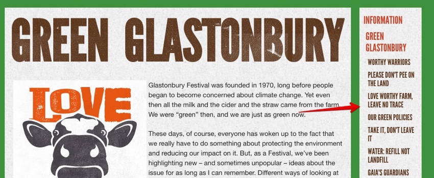
- The side navigation isn’t very intuitive, mainly because it changes, depending on the page, and because it’s on the right (which is unconventional). In many instances, I didn’t even notice, as I was looking up content, that it held more information.
Roskilde Festival

Background: Created by two high school students in 1971, Roskilde Foundation now runs the festival to support music, culture, and humanism. Spanning four days, this festival brings around 130,000 attendees, making it one of the largest music festivals in Europe and the largest in Northern Europe.
What works
- Viewing artists, listening, sharing, and following is super easy.
- Their FAQ is easy and intuitive, keeping all the information organized.
- Roskilde has its own iPhone app, allowing you to favorite bands and keep track of what you want to see.
What could be improved
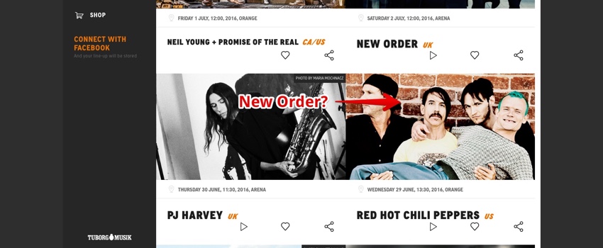
- The grid view is formatted in a way that almost seems like the band name goes with the image below.
- The quirky navigation makes it a little more fun, and there’s more of an ability to explore (especially with the bands), but it’s not entirely easy to use (the hover is triggered so often).
- The schedule is nice in a horizontal grid, but it’s not optimized for mobile (it’s actually hard to even get to on mobile), but I suppose this is what the app is for.
- I’d love to see more visuals/video of what the festival is like, to engage me more.
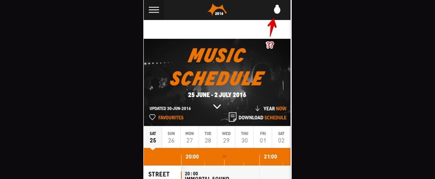
- There’s a prominent, but confusing, link to the festival’s organizer in top corner of the mobile view.
- Performance feels a little sluggish, with slow loading times and delays.
Psycho Las Vegas

Background: A three day “head-banging” festival hosts 90+ acts from around the world
What works
- This is a simple one page app for the most part, which keeps things simplified (but there are downsides).
- A looped hero video is captivating and engaging.
What could be improved
- The simple one page application means that links don’t trigger separate URL’s (which doesn’t do much for SEO and makes it harder for users to share specific parts of the site).
- The rest of the links go off the site to another third party site (which might make it slightly jarring).
- The image grid is interesting but not very usable, as you have to hover over each artist to see who they are (or rely on knowing their photo).
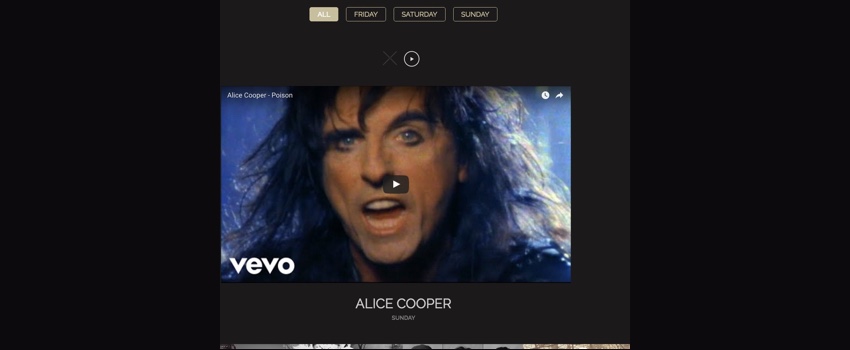
- On select of an artist, it just opens a YouTube video, their name, and the day they perform. Additionally, the use of the common “play” button as navigation to the next artist is confusing.
- There’s no “schedule” for when artists are actually playing – just an image grid to say who’s playing on each day.
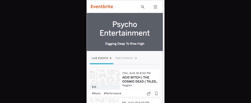
- Mobile site is not created; it opens an Eventbrite page distinctly different from the site (and, potentially, confusing).
What does this all mean? Who wins?
In the end, festivals in the past were fine without their online presence. One could argue that the US Festival was a great experience for those who attended, sans smartphones navigating their every move. And my experience at Coachella (even with crappy food and hot weather) was amazing, and at the time I think I had a Nokia flip phone.
But these days, technology has allowed us to be inundated with more information and more content at all hours of the day, from devices as small as watches. It seems only logical that these events cater to the “give me what I need, and don’t make me think” mantra to simplify our lives.
To that extent, it doesn’t matter if you’re a 40 year old festival touting 200k visitors or a small rock festival running for the first time, how you think about the usability, functionality, and content structure of your online presence can help or hinder the real life experience of your users (whether it helps them decide to go, eases any stress about what to expect, or makes it easy for them to plan their schedule once they are there). It’s imperative in today’s world that thinking about the users’ needs and the scenarios in which they might be using the information is key to providing the best online to complement the offline experience.
Do you have an experience you want to share? Let us know!