Flexbox is a new CSS3 standard for laying out elements on a webpage, without using floats or positioning. The flexible box layout also offers more freedom to arrange the content of a page depending on the size of the viewport. Currently 95% of modern browsers support flexbox, so its viability in day-to-day use is becoming more and more real.
Here is a little bit of what flexbox can do for you.
Let’s split this up evenly
One tremendous feature of flexbox is the ability to arrange elements in a container to proportionally fill all the available space between one another. This gives you the ability to have a column-based layout where you are able to define the sizes of each column and have them fill the appropriate space in the container. These dimensions can be changed per viewport size through media queries. Remember, this is without the use of floats or positioning. All the elements remain within the flow of the other elements on the page. You can even define the height of these columns so all of them line up properly. This is one of the biggest benefits of flexbox.
Order up!
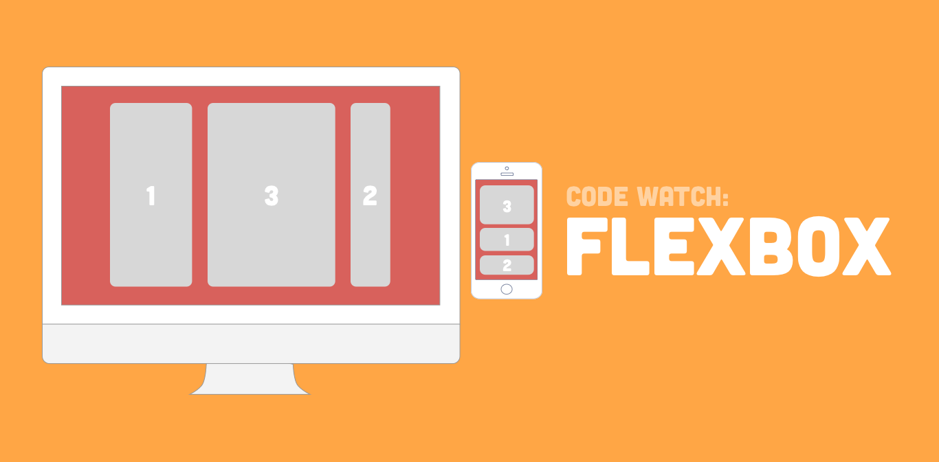
The next big selling point for flexbox is the ability to order these columns you have just created. You heard that right, you can order them in any way you like. Want the last element to appear first in the order? No problem. Simply set the ‘order’ property and tell it what you would like where.
.wrapper > aside {
  -webkit-order: 3;
  order: 3;
}
This is particularly handy for a two- or three-column layout where the main content is not in the first column. You can specify that content to be first when dropping down to a mobile or tablet layout. This has long been a desired behavior for web pages and, up until flexbox, has been a difficult problem to address.
Get in alignment
Another nice feature of flexbox is the ability to vertically align elements. This has been another long wished for solution in web layouts and there are a number of semi-hacky techniques out there to pull it off. With flexbox, you can simply assign a value to the ‘align-self’ property. This gives you an easy way to vertically align an element.
.wrapper > aside {
  align-self: center;
}
Wrapping up
These are just the high points on what flexbox offers us. In short, flexbox is what many frontend developers have been dreaming about for years and it is almost here. Caniuse puts its adoption at 95% with modern browsers, but there are still some issues with bugs in IE11. That being said, it is great time to start thinking about how it can be used in the future. In a few years from now, it should be standard practice to use flexbox in day-to-day coding.
To see flexbox in action, here is an example of how it can be used in a real layout.
See the Pen Flexbox Demo by Brian Middleton (@aapljack) on CodePen.