
I know what you might be thinking. This is a post about which Portland mayoral candidate I think might/should win this November. It’s not. I am by no means a political consultant. I don’t follow polls. And furthermore, I never like to talk politics (with strangers at least).
But what I do like to talk about is user experience design. And inspired by this recent article on the mobile differences between our two presidential candidates, I decided to take it local and conduct a quick usability audit on the sites of Portland’s mayoral candidates, Charlie Hales and Jefferson Smith.
Going Mobile…or Maybe Not
While we are on the topic, let’s talk mobile. Or in the case of Hales and Smith, the lack thereof.
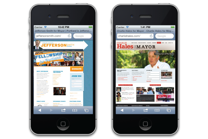
A look at how both sites render on a mobile device.
Unfortunately for the smartphone fiend, neither has even attempted a mobile site or responsive site. One advantage, you’re not running into the annoyances of a partial site (like mobile sites sometimes tend to do). But as a tradeoff, you’re having to squint to find what you need and pinch and zoom all over the place and use your pudgy fingers to try and select links. It doesn’t make it impossible, just more of a hassle. Furthermore, you have to take into account wait time for the page to fully load. A quick look into both candidates site told us that it takes about 1.5mb. to load Hales’ homepage on an average 3G cell phone and a heftier 2.5mb to load Smith’s. As someone who is surfing the web while they are sitting on a TriMet bus that means it would take close to 21 seconds to fully load Hales’ homepage and 30 seconds to fully load Smith’s. Taking into account the statistics Frost presented in his article, if half of the US population owns a smartphone and of that, 28% only have a smartphone to access the interweb, having a difficult site to navigate could be turning off potential volunteers, supporters or votes!
But moving on…let’s take a look at their non-mobile friendly sites.
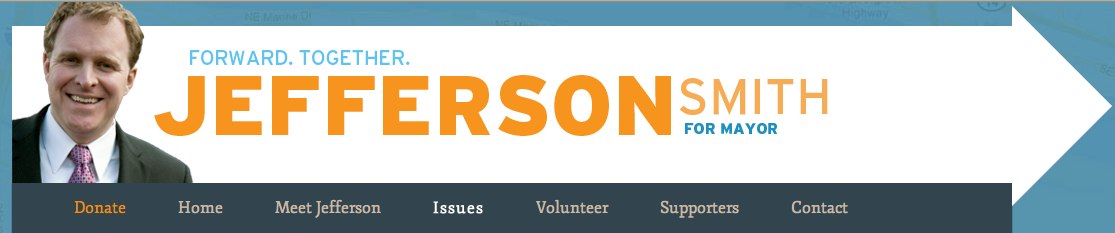
The “Hero” Panel
This is the first thing you see on the homepage and it gets your attention. Images are changing and rotating. Information is calling out at you waiting for your response. Because of this, it’s important that while they’ve got your attention, they do it right. And these days, how something looks is becoming just as important (see A List Aparts discussion In Defense of Eye Candy).
A look at Hale’s collage
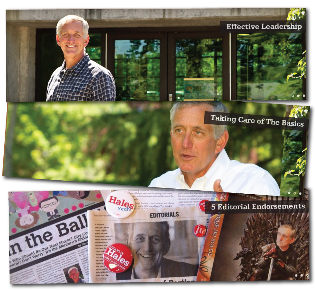
Hales’ panels.
Hales has three rotating banners, and for the most part, they are nice, clean images that are consistent to each other. But they don’t really call out at me. The titles seem more like captions to the images (“I had 5 Editorial Endorsements”). I didn’t even know that the images themselves took me anywhere, because there was nothing telling me “hey, check me out”. While the imagery is nice, I think with that prime real estate, he could do more to engage.
Onto Smith’s call outs
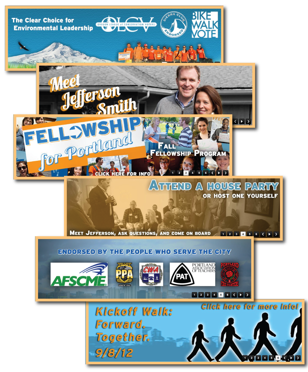
Smith’s call out banners
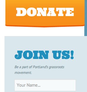
Smith has a collection of visuals that call out and inform. Some are just informational (“Here’s who endorses me”), some tell me to click for more information (“Meet Jefferson”), some are volunteer engagements (“Host a house party”) that I can be involved in. The content is engaging. The visual design, however, falls short. Some of the images are pixelated or poorly laid out on backgrounds (see hero 5 with pixelated logos placed on a dark background). Furthermore, each banner is stylistically different and it starts to look like banner ads you would see on a news site. You might even tune them out. A simple style guide could align all of the images into one cohesive brand. And lastly, the ability to choose which banner you want to go to (“I missed the second one, what did it say?”) is a nice feature, but the previous and next button then feel redundant, as is the ability to play or pause, and to me, just adds more clutter to the visual.
Navigation
I like a good easy-to-follow navigation. I like it when things are where they are supposed to be; that universal placement of things. And while I’m digging into the pages of a site, a good navigation is like a warm security blanket. It tells me where I am and how I can get safely back.
For the most part Hales and Smith have similar navigation with a few differences.

Hales’ navigation
Hales has a fairly straightforward navigation; one click to a page with a nice call out for “Donate” that you can’t miss it. What I also like is the breadcrumb-like links he uses as you dig down into a page (for example, if you select an issue to review, you’ll see below I’ve pointed to the links at the top to help guide you back to all the “Issues that Matter”, as well as navigation on the side.)
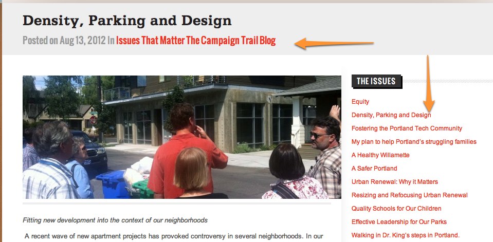
Like the extra help
But he has chosen to forgo the “Home” by making the header image a home link. That’s fine (at least the whole header is a link), but some non-power users may find themselves using “back” because they don’t see how to get home. A home icon could be a simple solution if space for “home” is not possible.

A home like this
Smith’s navigation
Smith changed things up by making “donate” the very first thing in the navigation. I get his motive, but it’s actually more distracting. My mind subconsciously goes there to get me back home. So while I was checking through his site, a number of times I went to “Home” only to find myself looking a donate page. I think a better location might be at the far right, suggesting, maybe, that users take the time to learn more about him, before they decide to donate. He also has his header link to home, but only in the text area, not his image on the far left, which I don’t think is as intuitive. Why not make the whole header?
Now onto his drop down. I don’t mind drop downs. They are especially helpful if you find your users try to navigate specifically to a page within a parent page. And Smith has utilized the drop downs for his users to go to specific issues and look up different ways of volunteering. What I don’t like is when menu items take you to a whole new page off of the site. I don’t mind if within a page a link directs you off (because there’s usually some warning or indication), but to me, links in a menu should take you to pages within that site. On Smith’s video link I thought it would, like the other links on his navigation, take me to a video page. Instead it took me to a YouTube – taking me completely off of Smith’s site without warning.
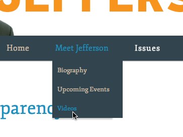
Beware – you will be taken off the site
It makes me wonder how many users he loses at that point, when he could easily embed some videos on his site with a link to more videos if he wanted.
Key Elements
I’m labeling things like buttons, call outs, and fonts key elements. They are the small things that bring the page together. I’m going to pick on Hales for a minute. While overall I think his site has a better, more aesthetic design, he has an affinity for drop shadows. And too much of it makes it confusing which is which.
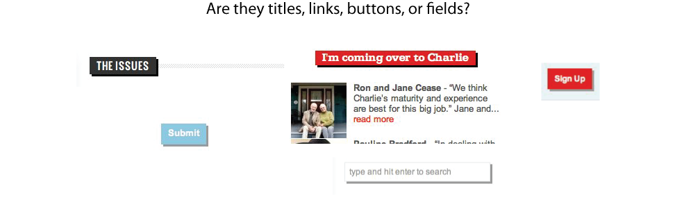
What does each do? Link? Submit?
Smith’s on the other hand has a font problem in my book. For websites I like easy, clean fonts. Like his header. Forward. Together.

A nice, clean, readable font.
It’s nice, appealing.
But the rest of his title fonts (“Meet Jefferson” “Jefferson on the Issues” “Donate”, etc) are quite the opposite. They are bulky and take up a lot of space.
Too big!
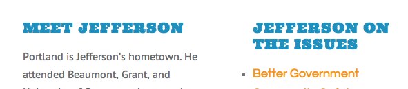
Too bulky!
And yet, the smaller they get the harder it is to read – like it’somebigclump.

Too smooshed!
Okay, okay, but what about what they say.
I know, when it comes to campaigns and a politician’s stand on issues, some of this design stuff may not matter as much. You’ll stand behind the person you think would best represent you. In this case, as long as the “stuff” is there, you’re okay. So I did a quick comparison of Smith’s and Hales’ “stuff”….
…aaaaand it’s pretty similar. You’ve got the bio section, the issues, a sign up to volunteer, a contact page, some social media stuff, and who also supports them. Good. But each takes things a bit farther that might help one way or another. I’ll point out the differences.
First Smith
- Appeal to Spanish-speaking constituents. While it might not be the whole site, members of the spanish-speaking community can learn about Jefferson Smith and read about one issue that might pertain to them, “Equality”, in their native language. (according to the US Census Bureau the Hispanic population was near 10% in 2010.)
- Ways to volunteer. Smith doesn’t just have one sign-in form to volunteer, he provides multiple ways a volunteer can become involved, such as information about door-to-door campaigning, hosting a house-party (with a separate page full of tips and tools on hosting a successful party), joining the campaign in a fellowship, or events anyone can attend.
- Events calendar. that said…the events calendar is nice. For someone who wants to get involved, but is unsure, attending an event might be just the thing. And seeing a full calendar of things to do is really helpful.
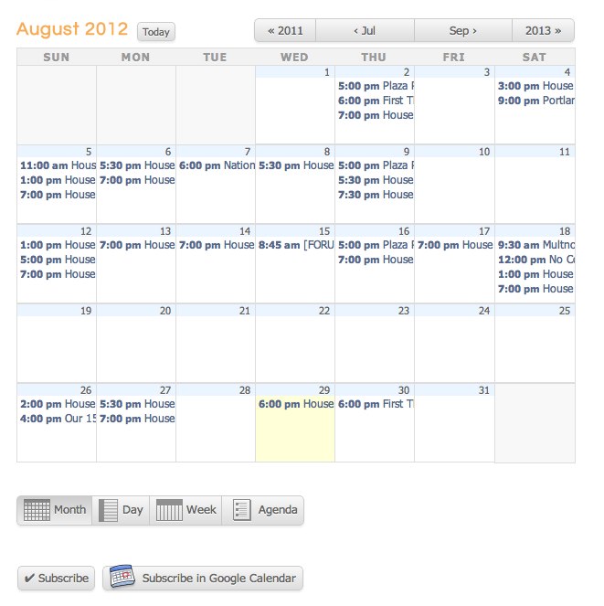
Look at all these events!
Now Hales
- A videos page. You know my gripe here – make it easy for me to view a video WHILE I’m on your site.
- A testimonials page. While you can only get to this by the homepage, there’s something really convincing to see individuals (noteable and not) giving their reasons why they support Hales. I just wish he linked to this a little more (like from his endorsers page!)
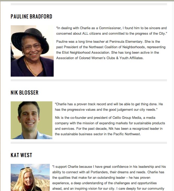
Testimonials give credibility
- A blog. It’s a little less formal and may give more insight into the person.
And the winner is?
In the world of UX – my nit-picky-ness aside (Hey! It’s my job!) – I think both candidates did a good job of layout and getting the important information out for people to view. And, for the most part, it was pretty easy to find the information one might seek as they pick a candidate to elect. I don’t know that the design will influence who will win (I had my vote figured out for this guy long before). This was merely an exercise we at Planet Argon thought might be interesting to take on and something we do for clients. But, maybe some of you out there are just starting your research and, maybe what you find (or don’t find) may influence your vote.
Who do you think wins (on the UX level that is)? Post a comment and let us know your thoughts.
Looking for your own usability audit? Or wondering how it might help? Get in touch with us if you’d like to chat about usability audits. Or take a look at our Usability Audit services. We outline some of the advantages, as well as our process and what we look for in our review.